
Overview
Nuleep is an app that offers a platform to help jobseekers as well as employees by facilitating the matching process. They accomplish this by helping job seekers and employers narrow down their values, work culture, and skills.
With new surge in unemployment rate due to the COVID-19 pandemic, it becomes even tougher for entry level job seekers (16 to 29-year-olds) to find their first jobs. They make up under a quarter of the whole labor force, yet “they accounted for about a third of the rise in the unemployment rate between February and April of this year.”

My Role: Researcher, Led the Visual design and created High-Fi
number of team members: Maryam Soltani, Qadro Mohamud, Vanessa Li
Duration: Jan 2020 - Feb 2021
Summary of methods and approach: Conducted user interview, Created personas, Task and User flow, Problem and Solution statement, Sketching & Wireframing, Prototyping, User testing.
End deliverable: High- Fedality Prototype
Tools: Paper, Figma, InVision, Miro, Whimsical
Our goal:
1. Improve the existing job search experience by introducing the new resume feature extraction
2. Navigate users to customize and tailor their resumes specific to the job postings
3. Incentivize users to prepare job specific resumes easily using mobile app rather than desktop via designing intuitive flows and user friendly interactions
Competitive Analysis
In order to gather data and ideas to design the resume builder interface, we put a lot of time and effort doing research and data collection. Our first observation was that the app had great automated features, but UI was not as good.
We started our competitive analysis by looking at some of popular job searching sites such as LinkedIn, Glassdoor, and Resume Builder.
We started our competitive analysis by looking at some of popular job searching sites such as LinkedIn, Glassdoor, and Resume Builder.
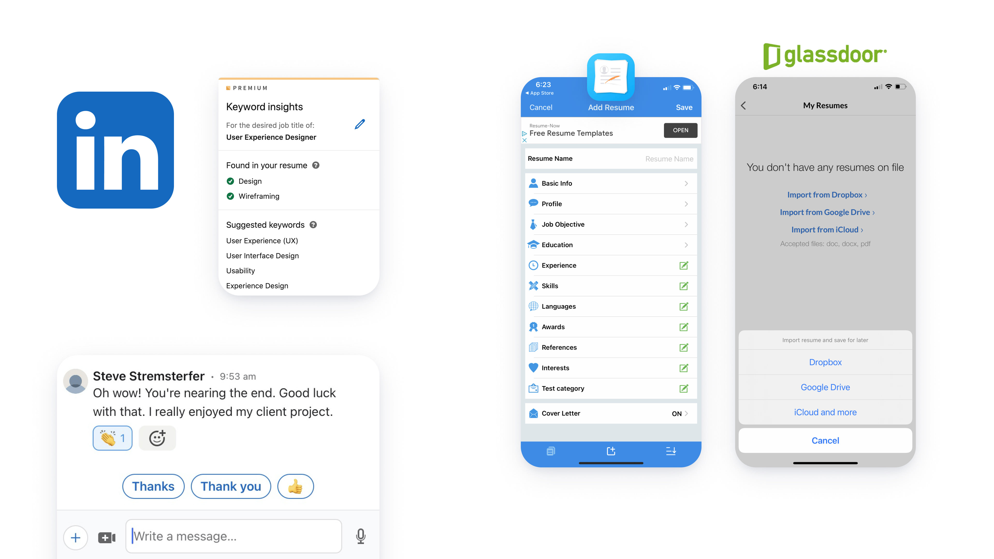
We were interested in learning common features and flows that were consistent between all those apps.
Our focus was mainly on::
Our focus was mainly on::
-Autofill - for filling in Schools, Companies, and Job titles
-Ability to save multiples resumes
-Mobile platform available- We noticed that many sites had great resume builder on their desktop platform, but that didn’t translate onto their mobile.
-Keyword Finder/Detector
-Sugestive wording
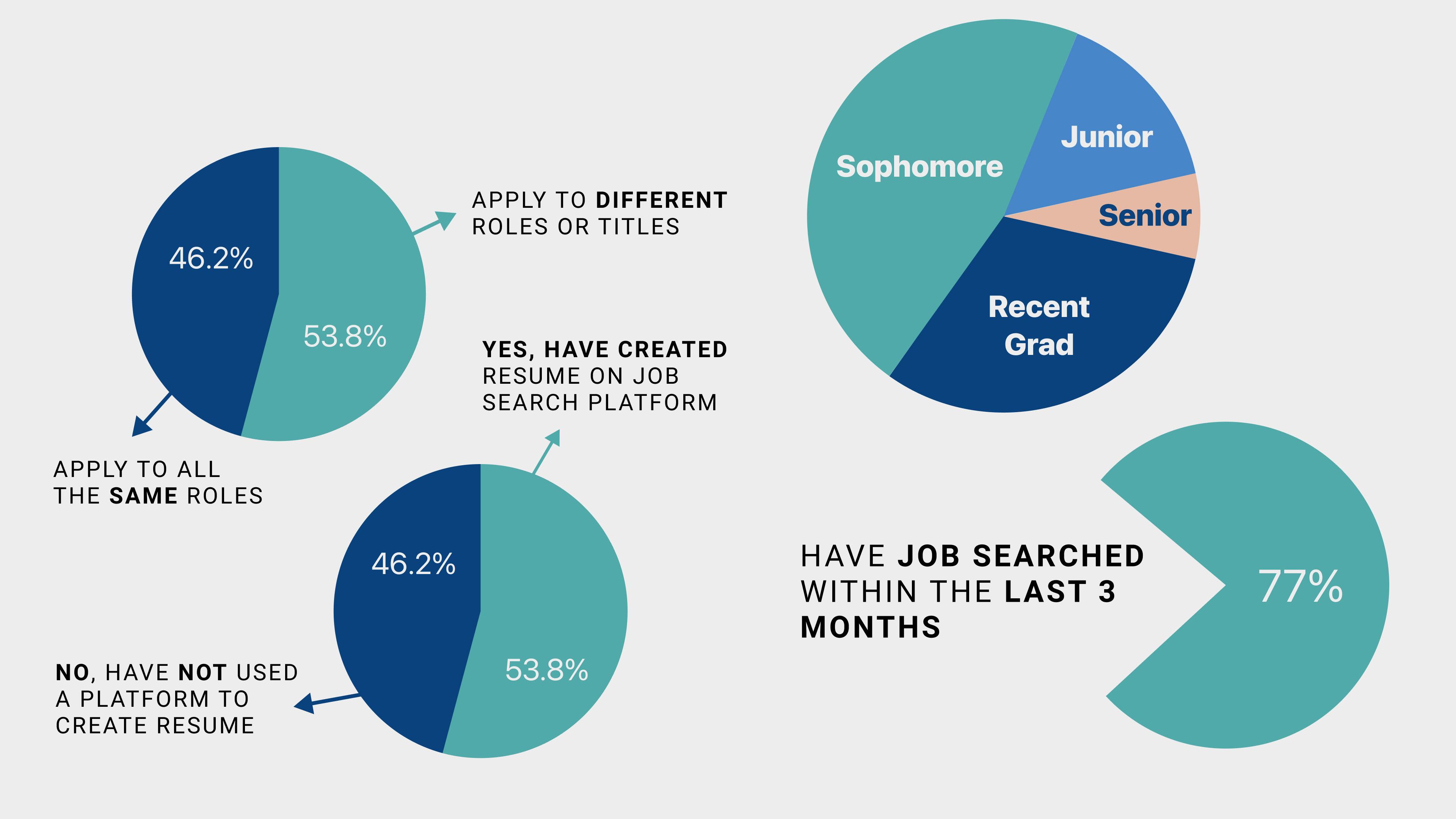
Surveys
-Conducting some user tests, as well as created a survey so we could gather some quantitative data.
-Learned that over half of our users have used a platform to create a resume
-Learned that 77% of our users have searched for jobs within the last 3 months. And about half said they apply for many different roles during their job search.
-Learned that over half of our users have used a platform to create a resume
-Learned that 77% of our users have searched for jobs within the last 3 months. And about half said they apply for many different roles during their job search.
-Saw a breakdown of our targed users.
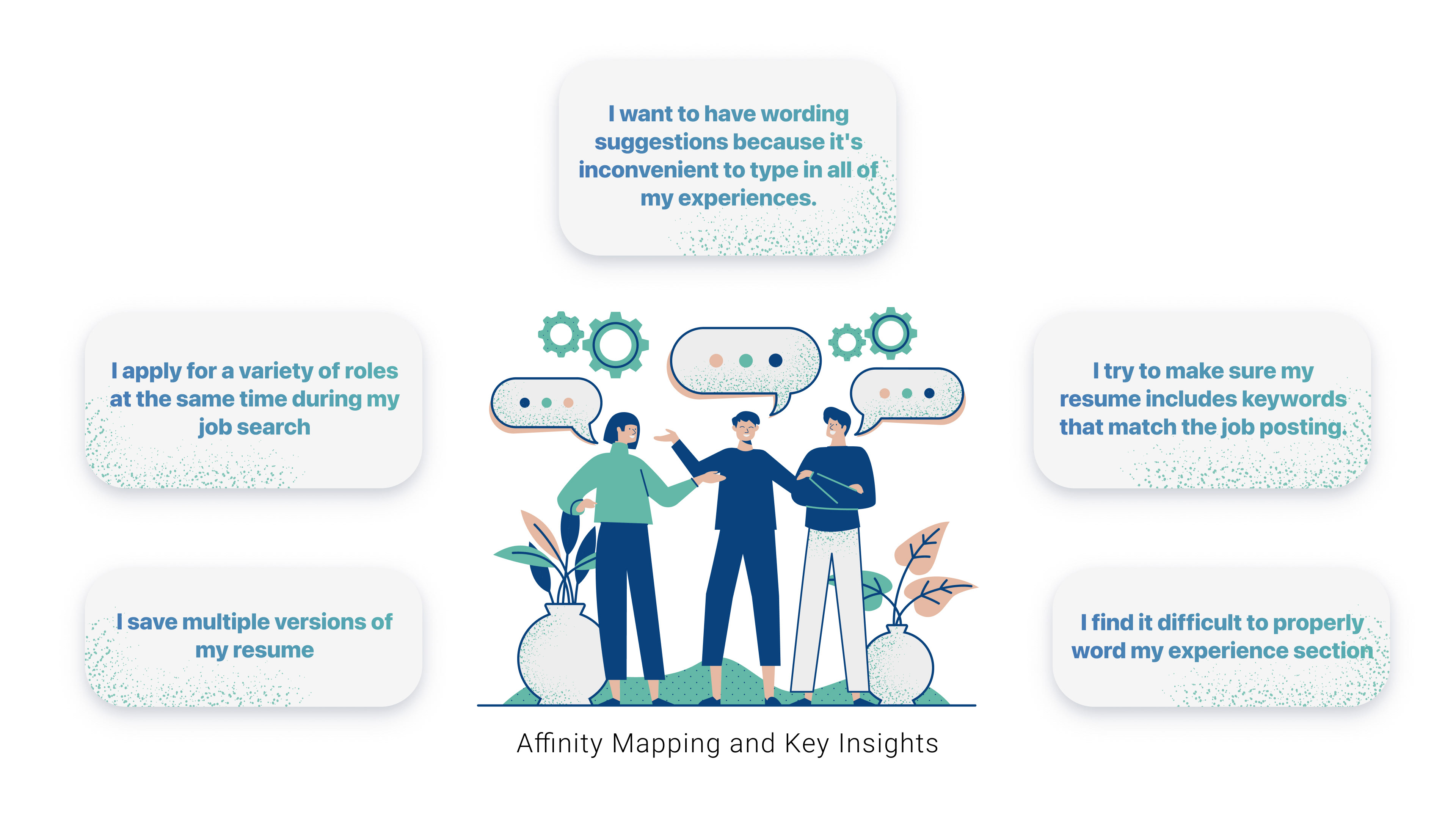
User Interviews(I Statements)
We then begin Affinity Mapping, and generated our “I” statments from our reserach.
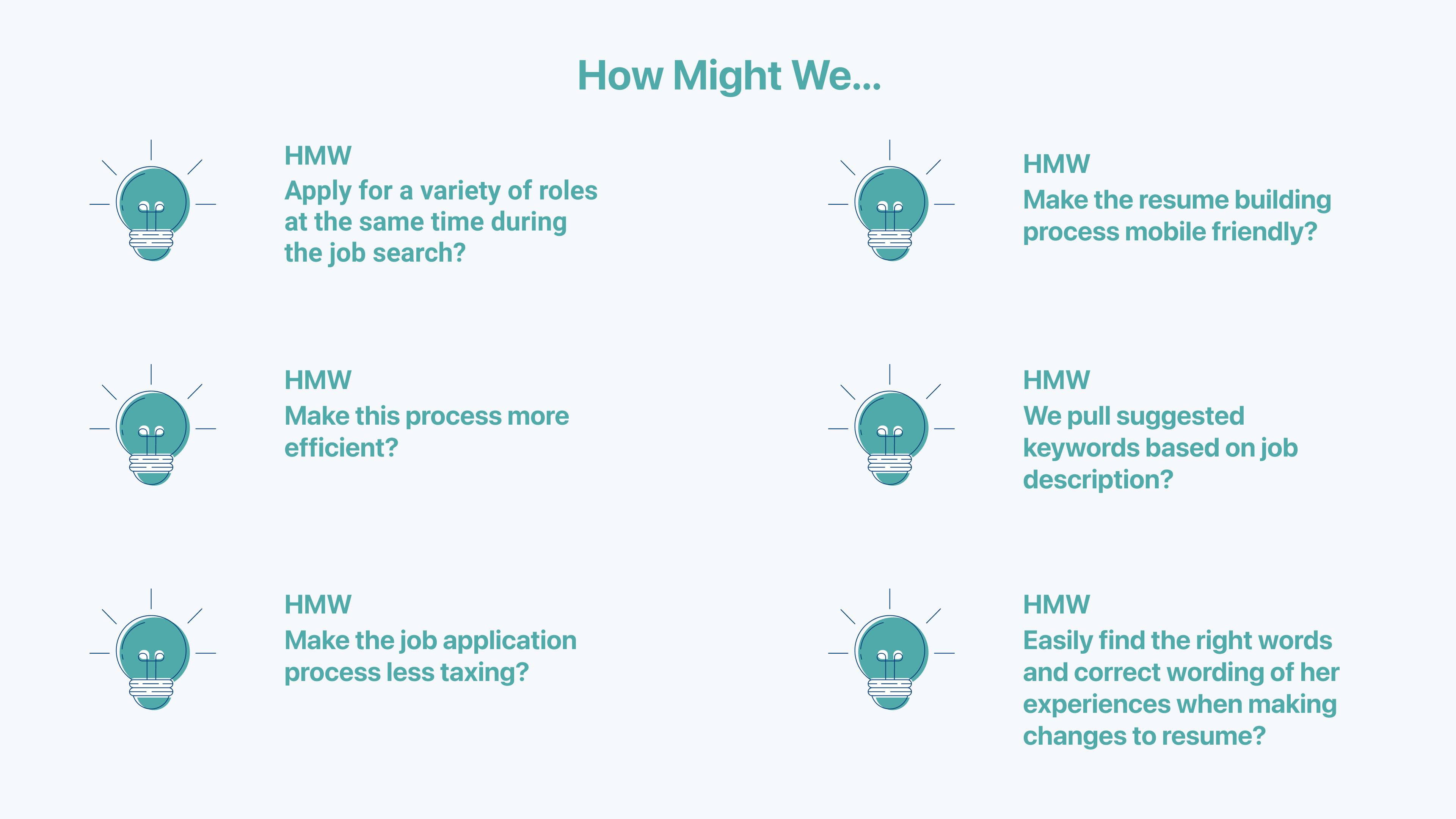
-I apply for a variety of roles at the same time during my job search
-I save multiple versions of my resume
-I want to have wording suggestions because it's inconvenient to type in all of my experiences.
-I try to make sure my resume includes keywords that match the job posting.
-I find it difficult to properly word my experience section
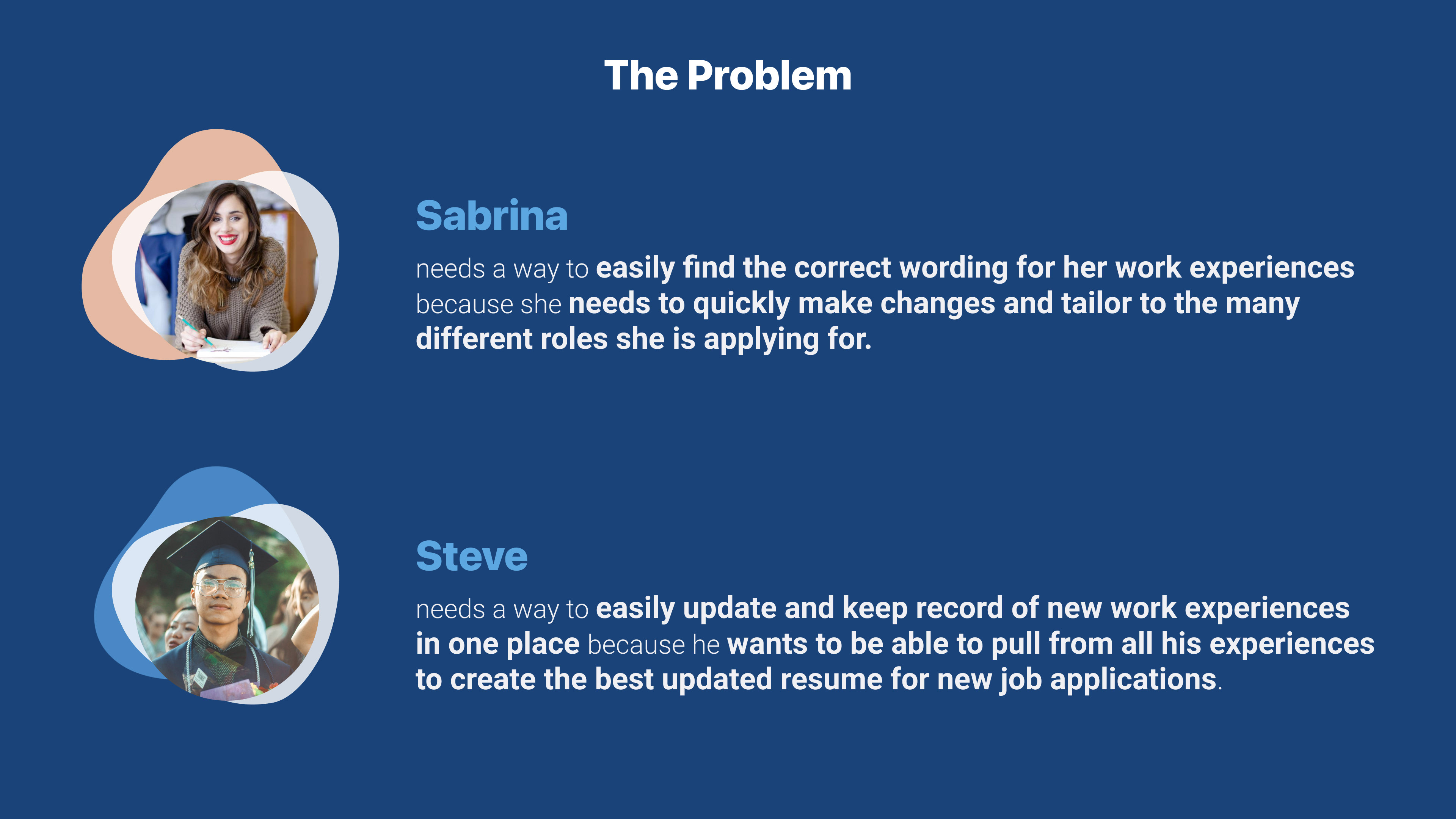
Persona
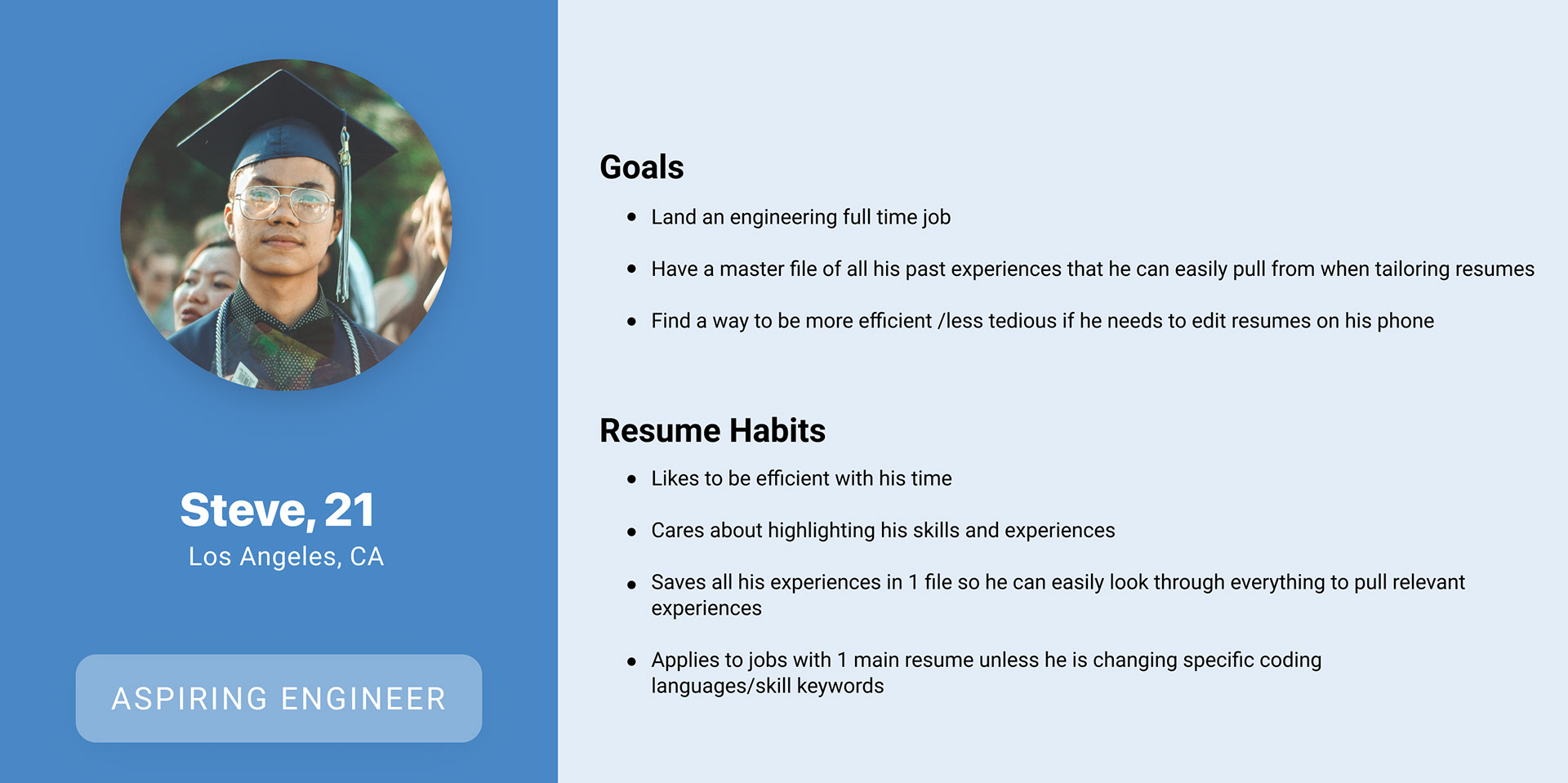
Our first persona is Steve. He is an aspiring Engineer who doesn’t often update his resume. He believes that if he’s not a complete match with the job posting, he won’t bother applying. He typically only prepares 1 general resume for all the jobs he applies to.His current preferred method of updating his Resume include Latex (resume builder for programmers), as well as Google drive.
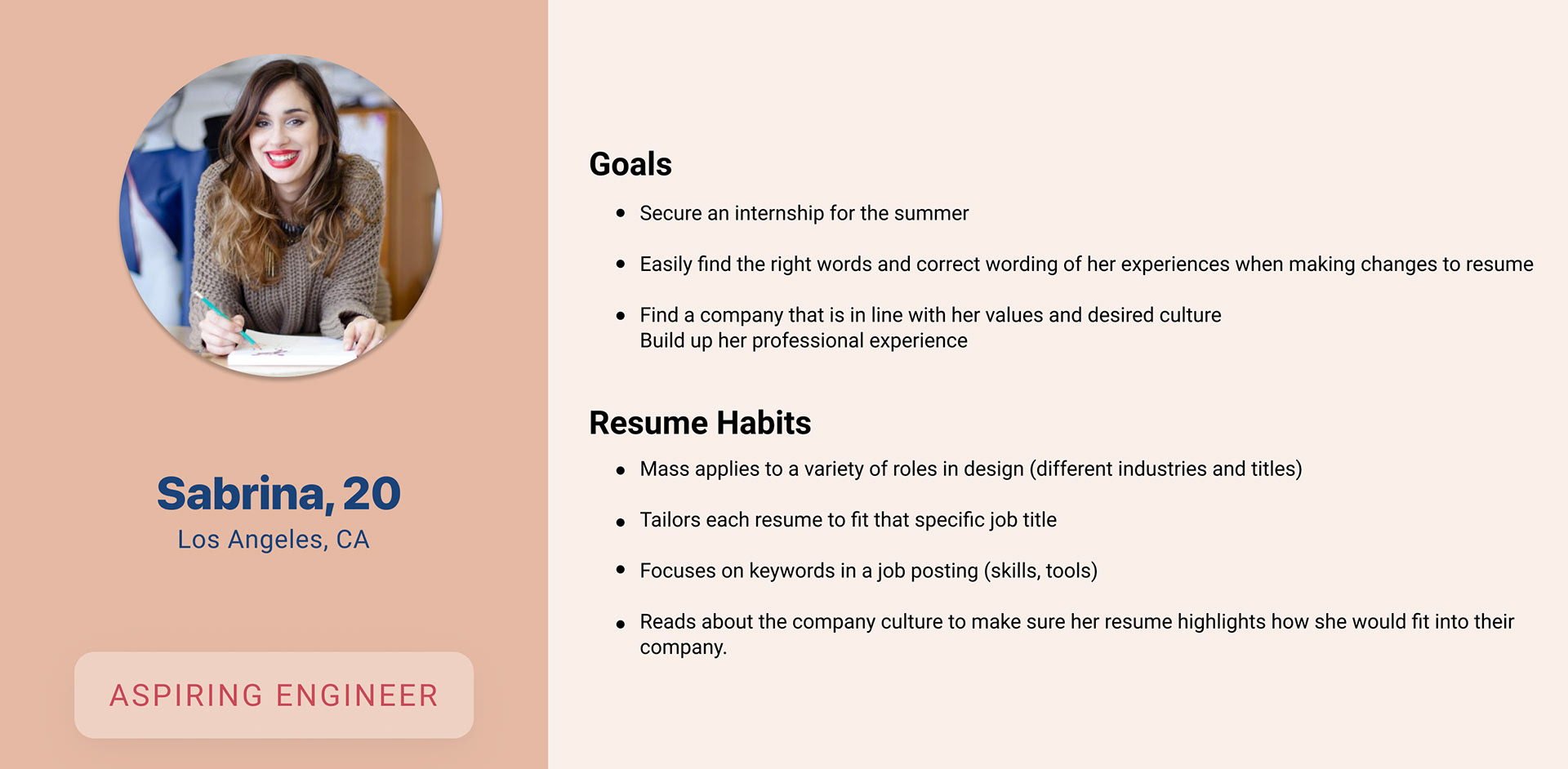
Our second persona is Sabrina. She’s a Aspiring Designer. She frequently updates her resume to better match the variety of roles she applies for. She would love it if she could create multiple resume while she’s busy juggling many things. Her current preferred method of updating her resume include Canva and Indesign.


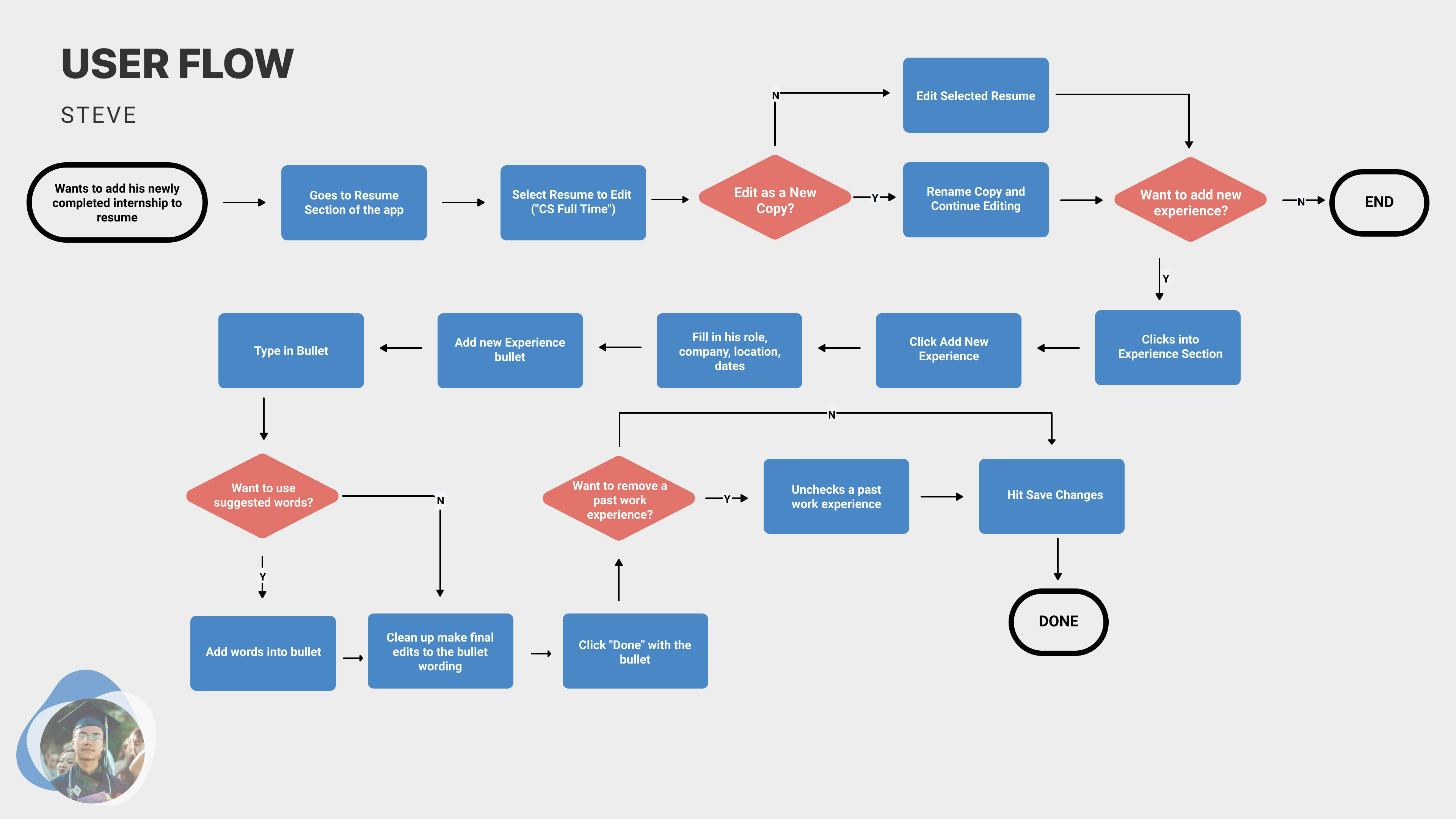
Steve's User Flow
Steve has just finished an internship at CISCO. his main focus is to add a new experince to his Master resume. He selects which resume version to edit, adds a new experince using the suggested keyword feature. He then saves as a new resume, and is done.
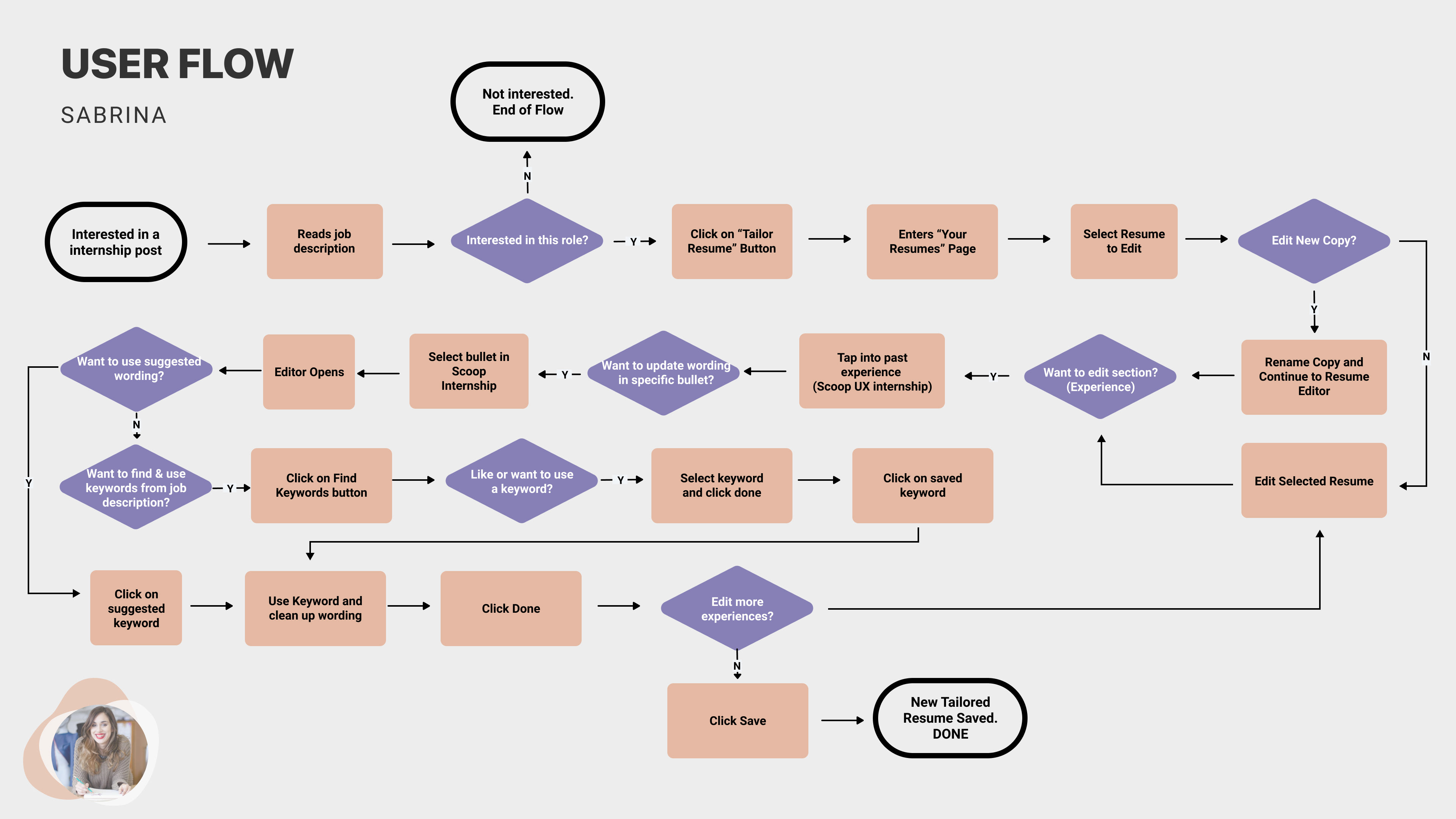
Sabrina's User Flow
For Sabrina’s flow she finds a new job posting and begins generating a resume for that job.
She selects tailor resume, and begins to edit her experience using the suggested keywords feature. She then saves as a new resume, and when she is done, she continues browsing for more internships and jobs.
She selects tailor resume, and begins to edit her experience using the suggested keywords feature. She then saves as a new resume, and when she is done, she continues browsing for more internships and jobs.
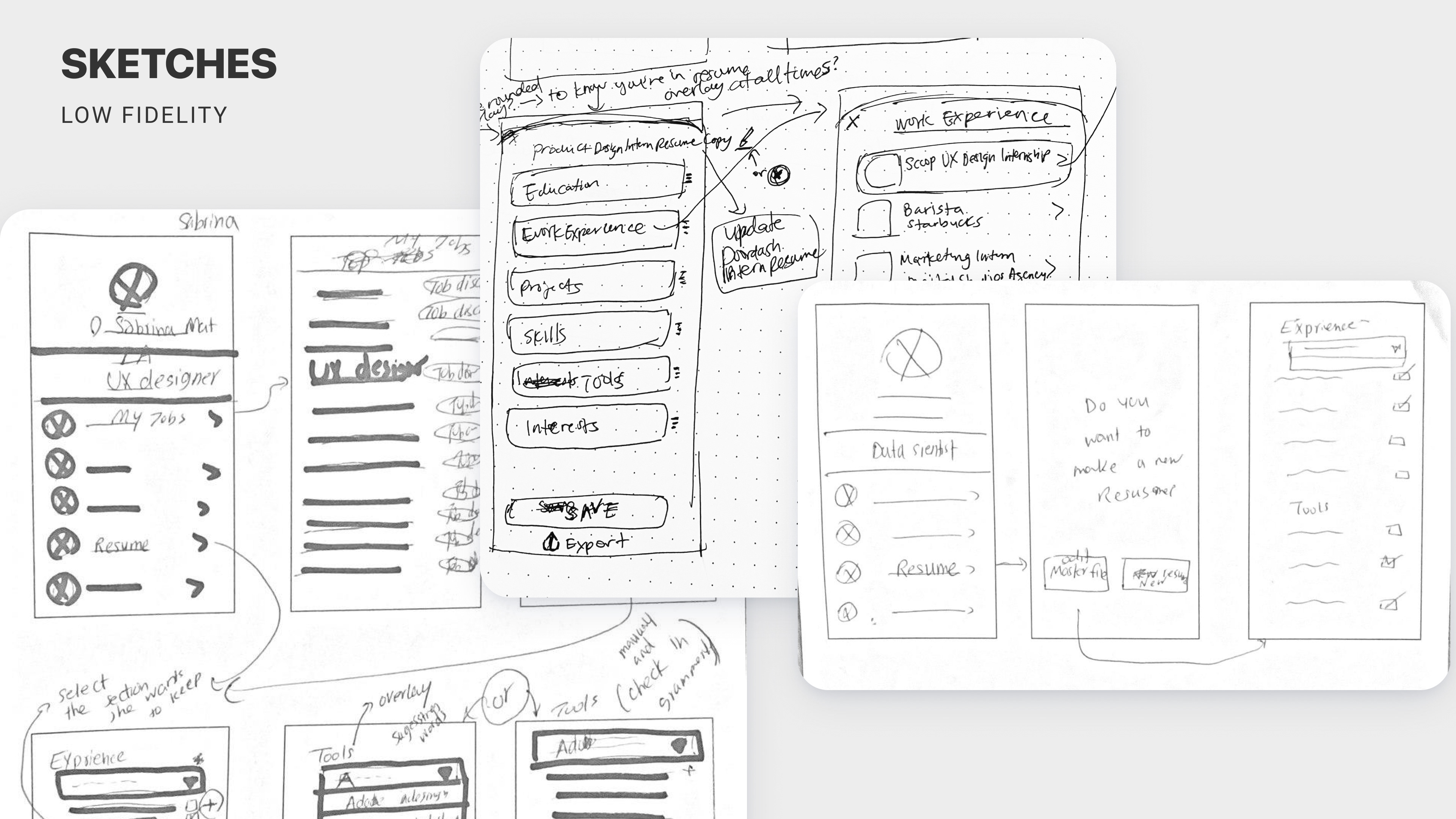
Sketching
From there we started sketching while thinking about how Sabrina and Steve go about solving their problem
Rapid Research - Feature Inspiration
We searched a lot for inspiration in apps that had overlays. Our feature is very overlay heavy. Figuring out to navigate and design something intuitive when the user is constantly switching between overlays.
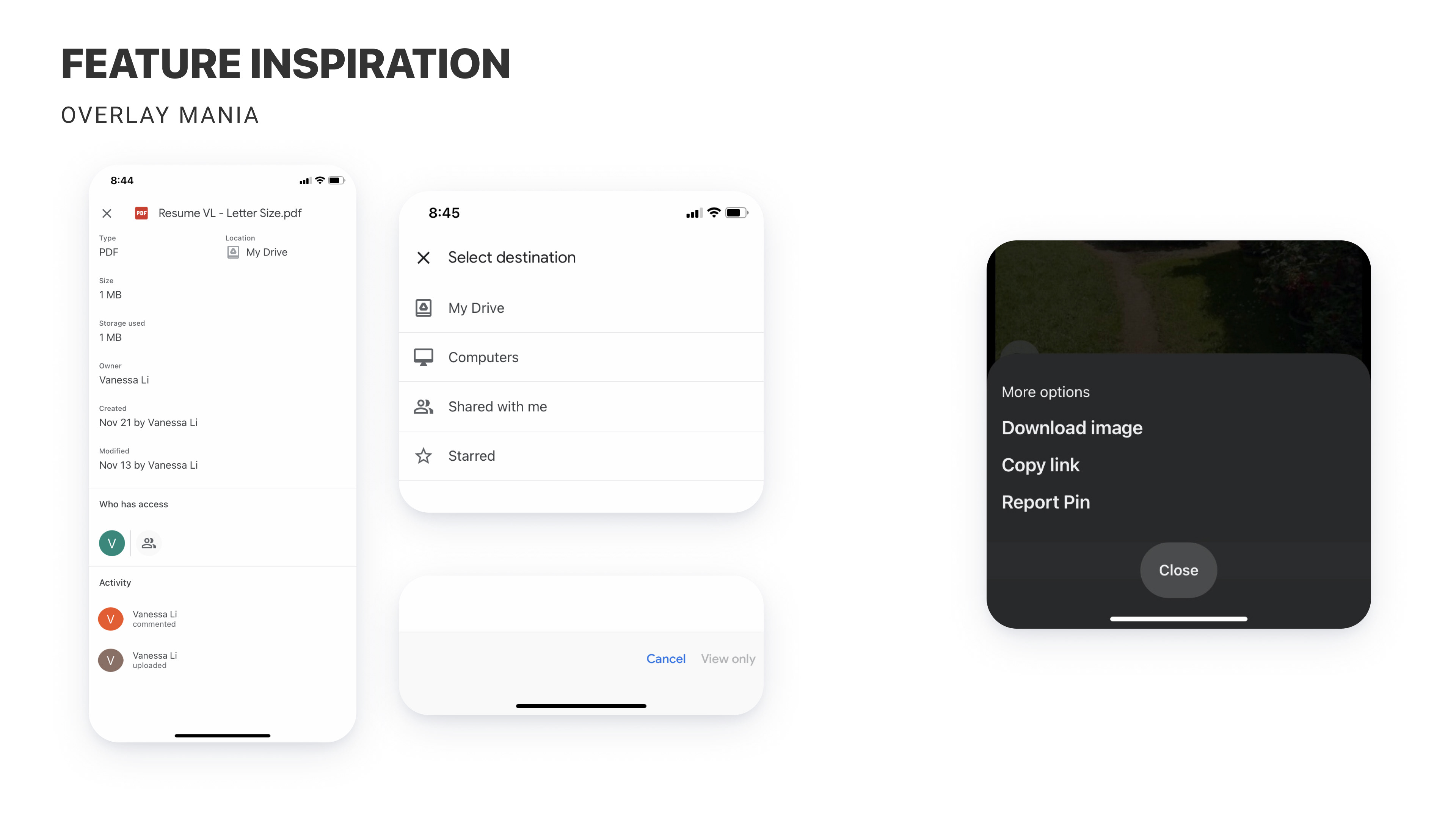
One of most important and key processes in this project was Sabrina's flow to adapt her resume to a job posting. To better understand the flow we researched some of most commonly used apps such as Google Drive and Pinterest that are well known for their high level of overlays. In our case Sabrina needed to customize her resume for a specific job while visiting the job posting page. Most of her flow exists in the form of overlays on top of the same page. That motivated us to further analyze Google Drive and Pinterest which are best known for being simple and intuitive for the users despite numerous interactions that happens within and between overlays. So we decided to focus more on them and our goal was to better understand their interface and flow.
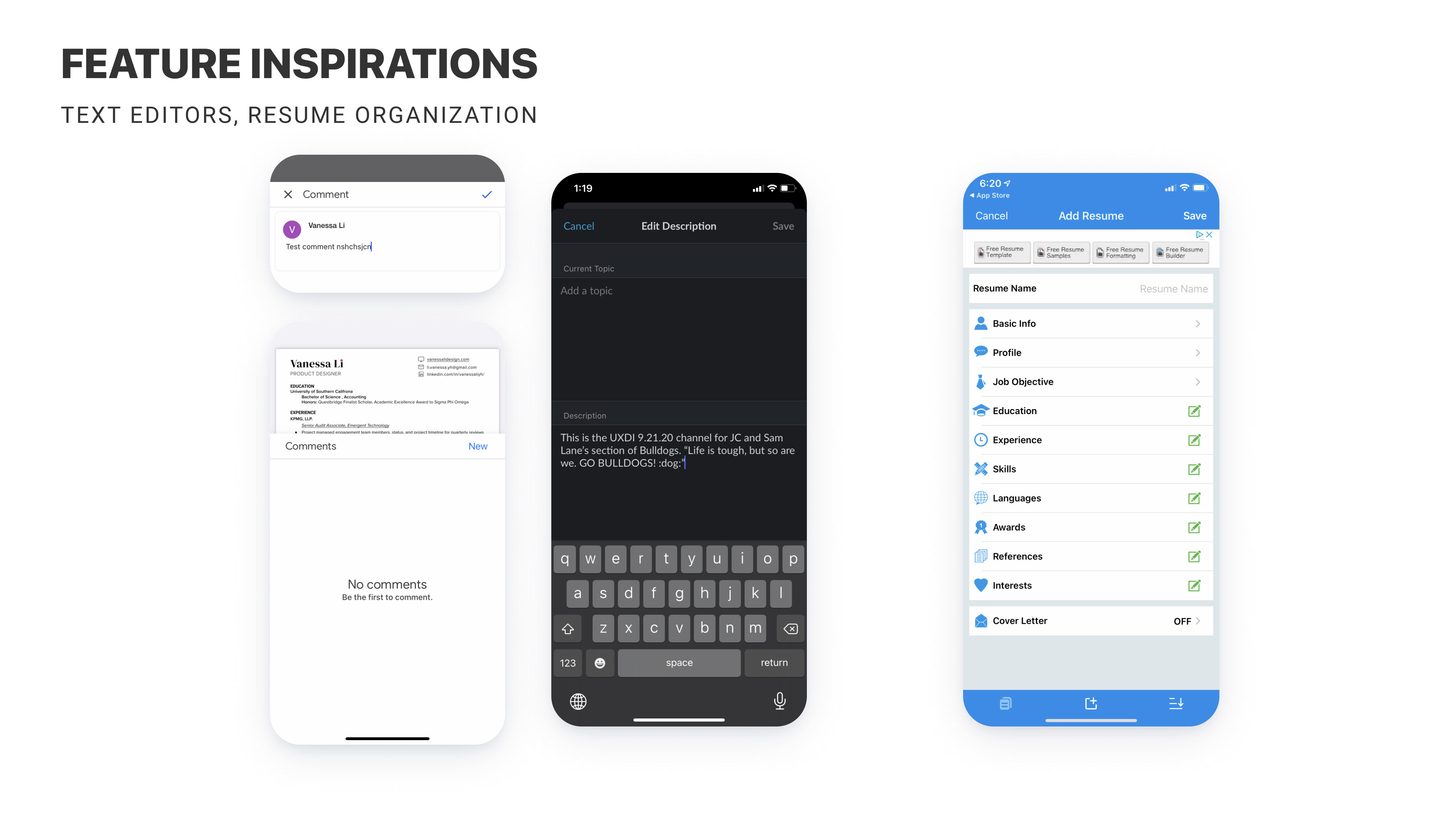
In order to come up with best practices for our text editor section we took a deeper look at most often used apps such as Google Drive and Slack. For example as it can be seen in the above snapshots, we have placed the "close" and "done" options on the top left and right of text editor screens trying to follow common UI patterns that users are used to in order to make the flow in our app more intuitive.
Other than mentioned famous apps our team also researched other resume builder apps such Quick Resume Pro to get different ideas on how to organize our resume builder information.
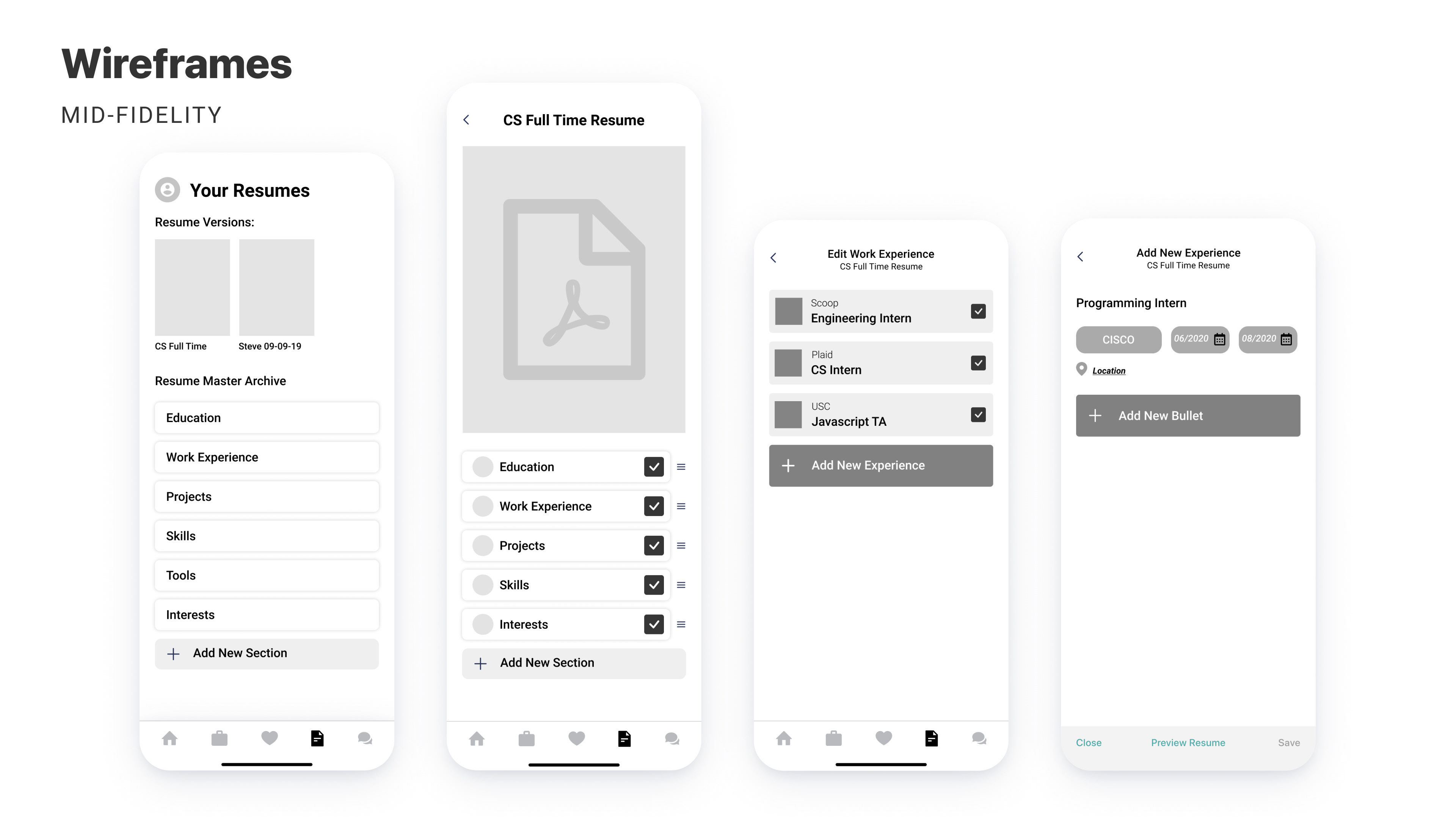
Wireframes
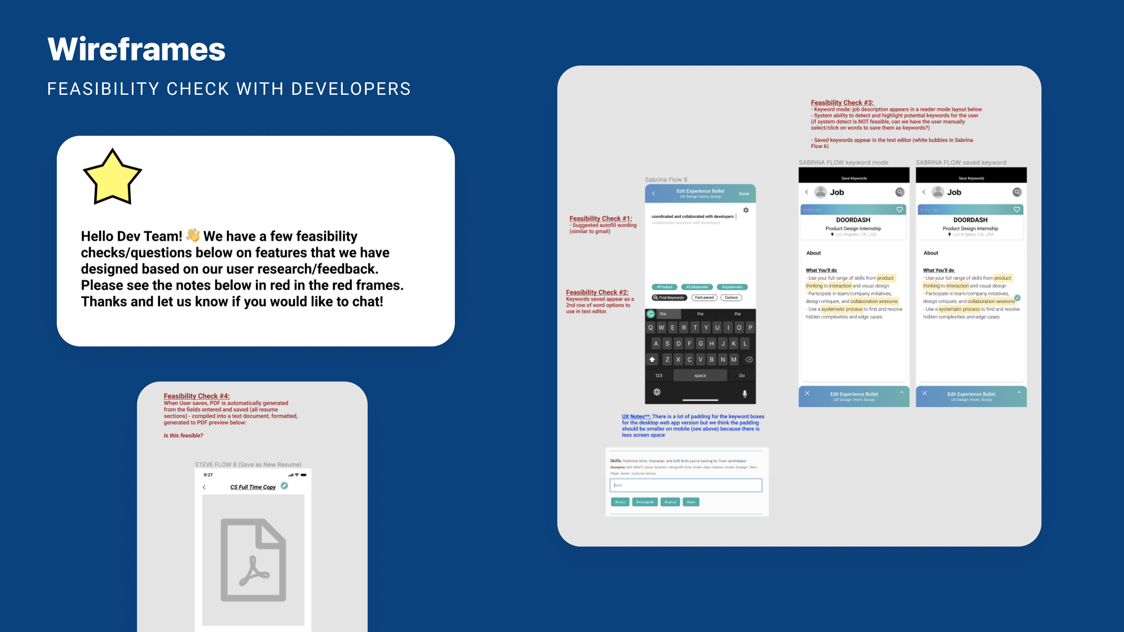
The following wireframe is depicting Sabrina's flow for her job application process which describes our focus and key feature for this app. Resume custimization starts after she selects the resume and picks the work experience she wants to modify, then she clicks on a bullet point tile to begin editing:
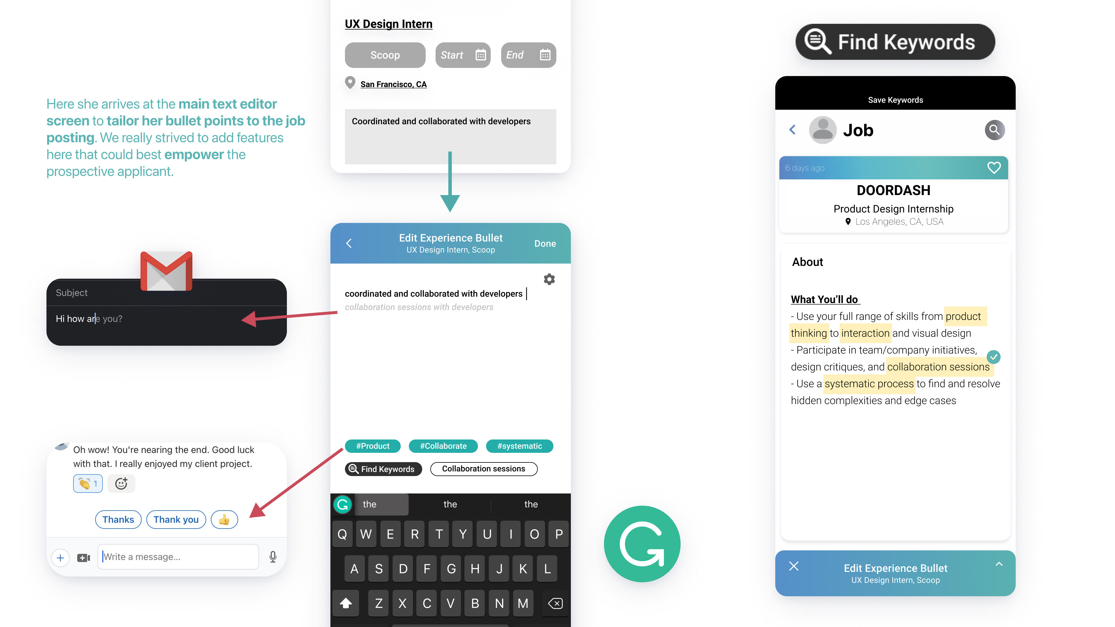
Like many well stablished editing apps our app also uses a word suggestion feature to help her autofill and complete the sentences as she types. The idea of the editor suggesting keywords to include in her bullet point highlights is similar to Linkedin's messaging where different replies are suggested by app.
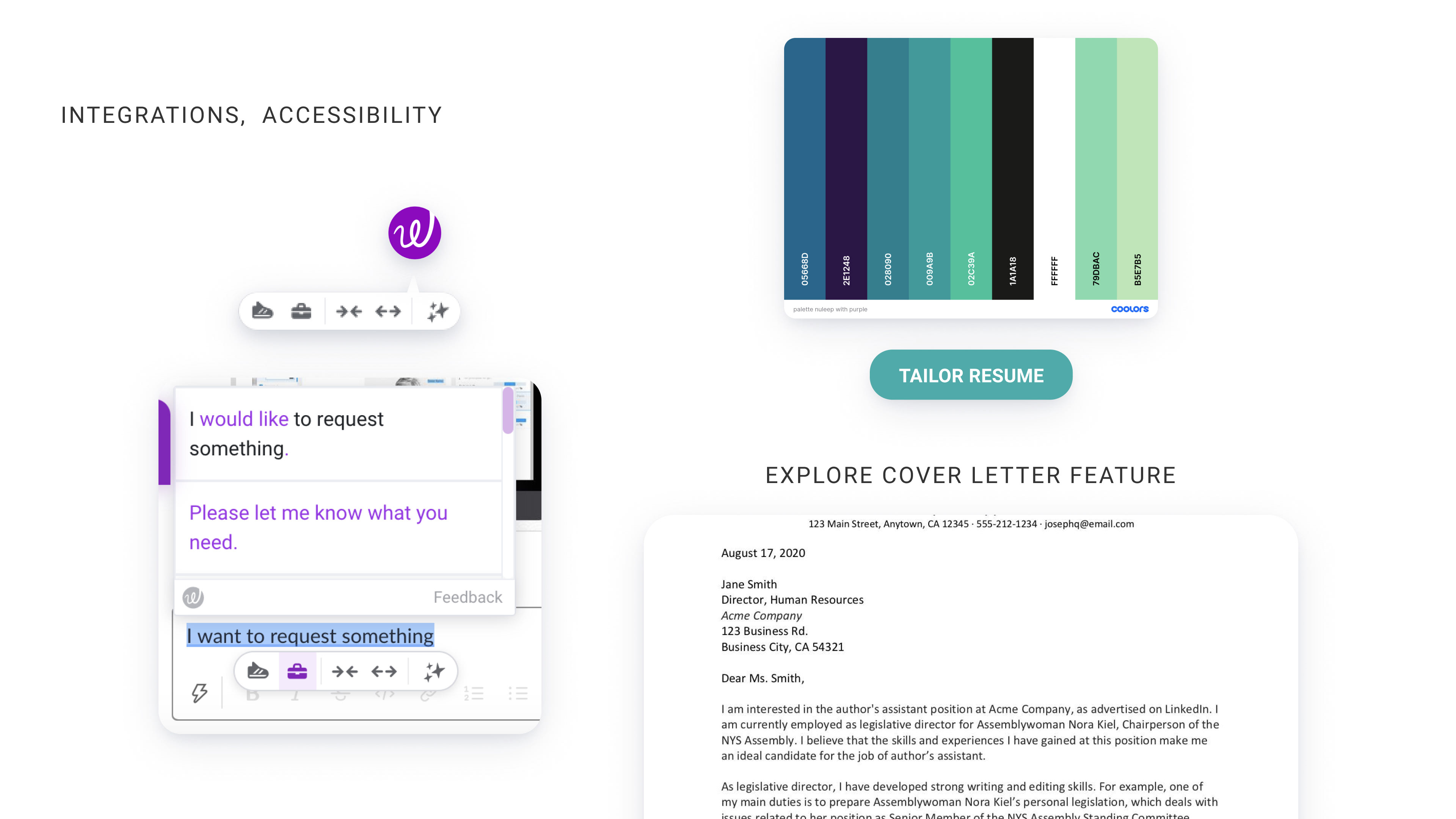
Our most important feature "Find Keywords" uses AI to auto highlight the important keywords from job descrption and suggest them to the user while editing the resume as bullet points.
We also Checked feasibility with developers because we thought our text editor screen is very feature heavy.
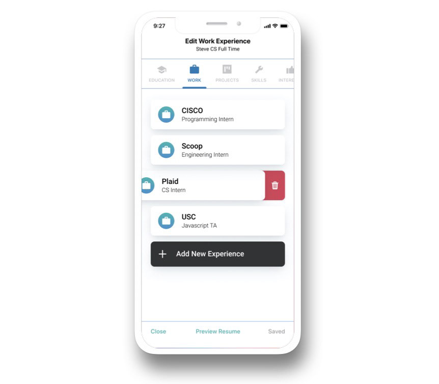
Below is Steve’s flow as he goes to his main resumes page where he chooses a resume draft to edit , clicks on work experience, and clicks add new experience to add his newly completed Internship.
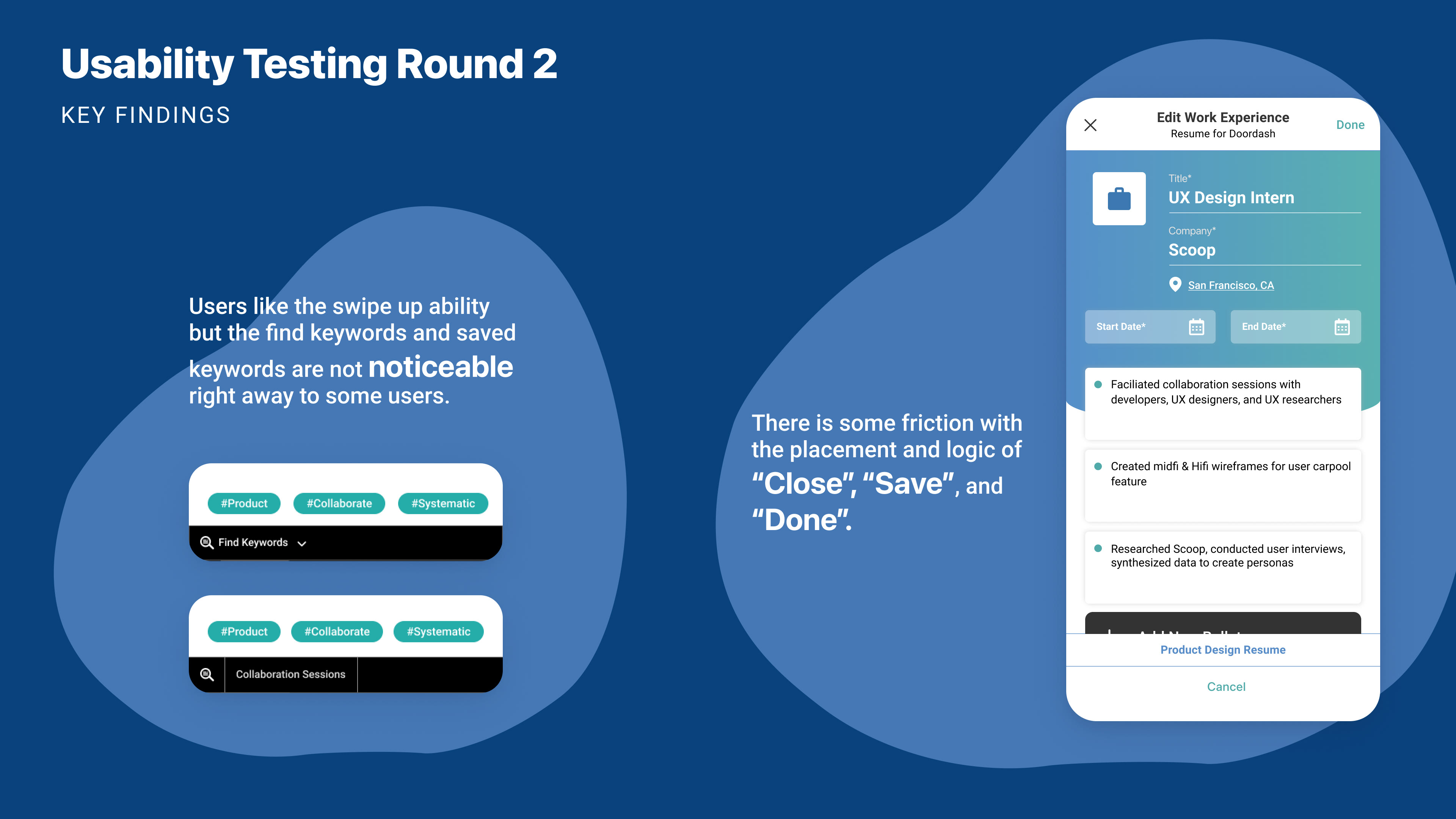
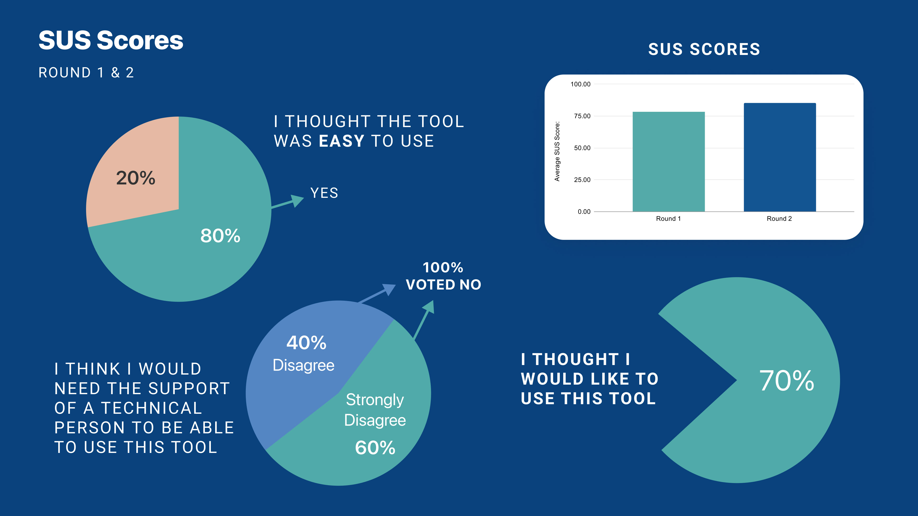
Usability Testing Round 1
1. For the 1st Round of Usability Testing we found that user we’re unsure the main differences between the 2 rows of keywords. Why were they 2 different colors and what is the difference?
2.They we’re also confused on how to get back to the Job Posting after they select and save keywords. (Unclear that they need to open the text editor again from the bottom)
2.They we’re also confused on how to get back to the Job Posting after they select and save keywords. (Unclear that they need to open the text editor again from the bottom)
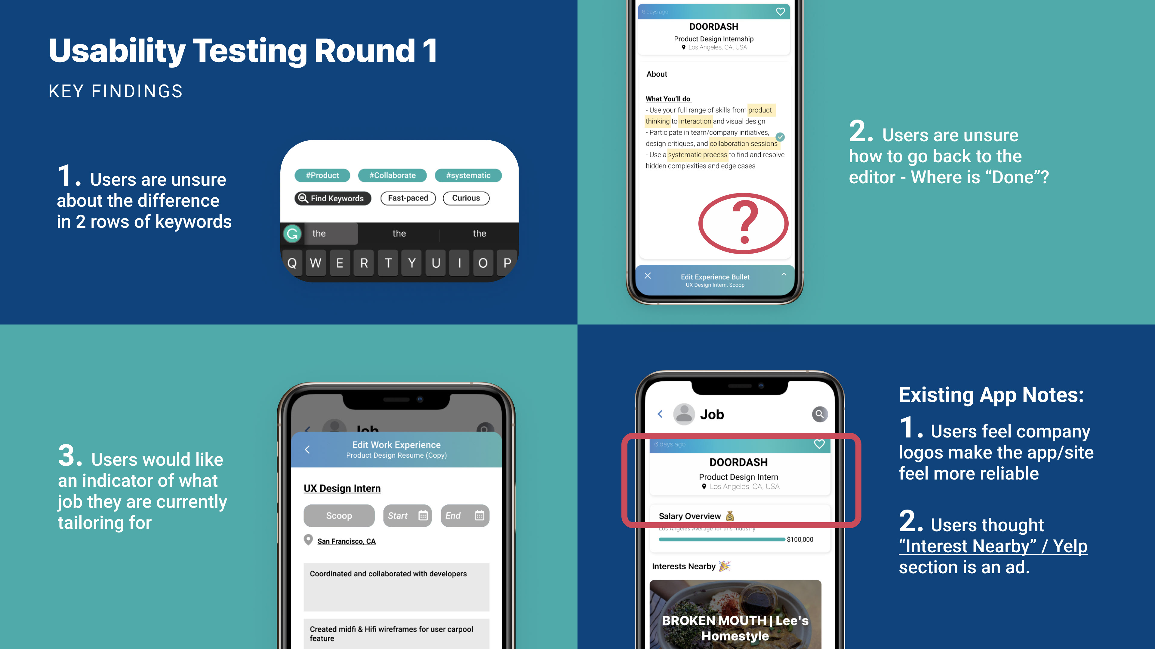
3. They wanted indicators reminding them which job they we’re currently applying for. This was also because the flow is very long and had many overlays.
Last: Seeing the company Logos makes it feel more trustworthy to users. They said it felt “sketchy” when companies on Linkedin didnt have logos.
Lastly, there was some confusion on “interest Nearby” section. (Yelp restaurants near the company)
Last: Seeing the company Logos makes it feel more trustworthy to users. They said it felt “sketchy” when companies on Linkedin didnt have logos.
Lastly, there was some confusion on “interest Nearby” section. (Yelp restaurants near the company)

Iteration 1
Based on our usability testing we started to iterate.
How can we make the flow more simple & intuitive to solve the problem where users lose track of which job they are applying to and may feel overwhelmed by amount of overlays and steps?

How can we improve our key feature?
Users get lost having the overlay minimize to a different view of the job posting (logic issue - why is the job post different)
Users lost how to move forward - set up clear done button and clear difference in words
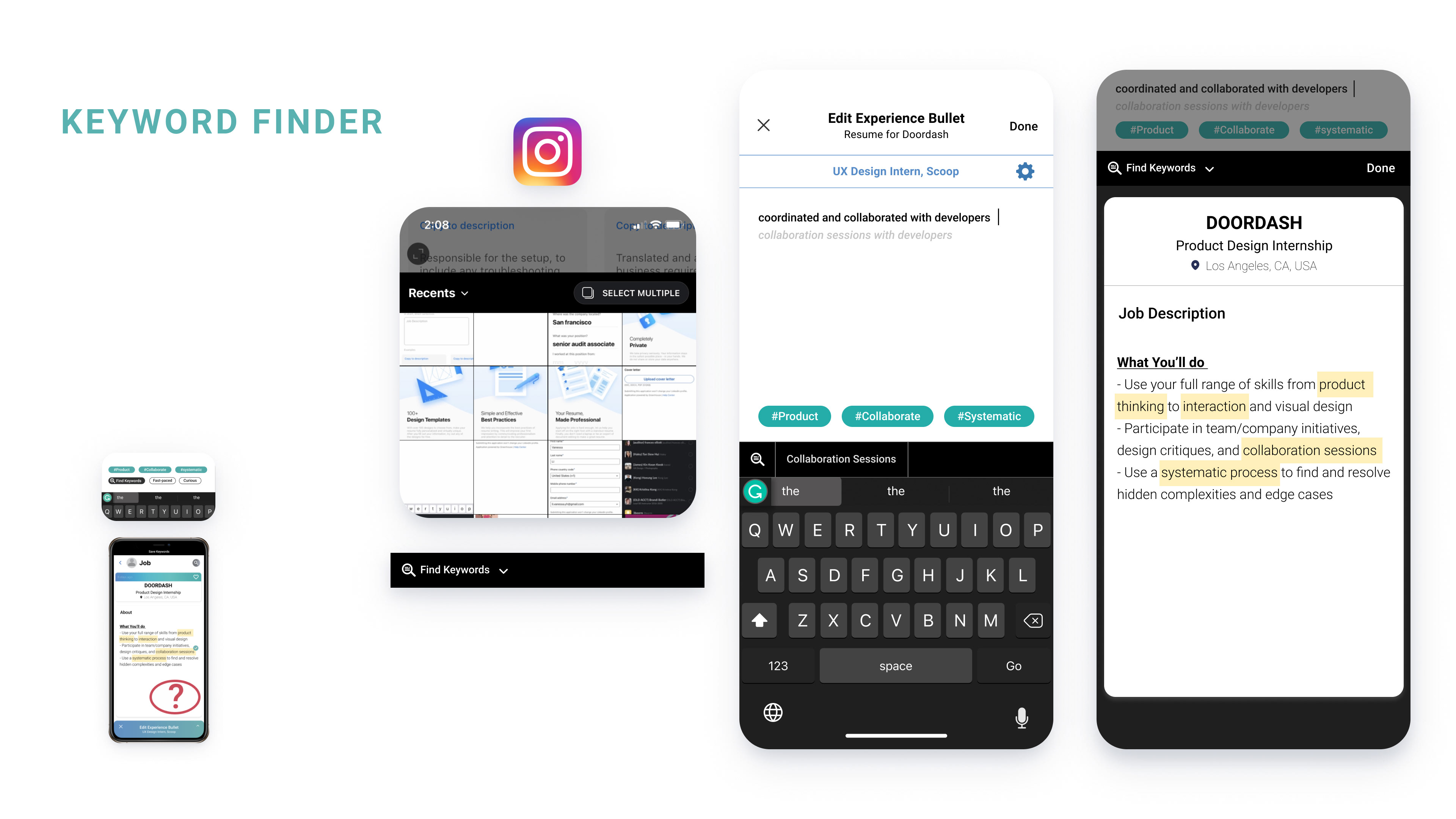
Keyword Finder
During usability testing users complained about being confused when editor minimizes upon clicking "Find Keywords", and they redirect back to the job page with a different view. Another point of confusion for the users was going back to editor after saving the words. Similar issues were depicted by users about having 2 rows of words with different colorings.
Being inspired by instagram we decided to combine the editing process into a single screen. It is similar to the create new post process of the instagram where the photo gallery is still reachable in the bottom half of the screen.
Similarly in modified design of the app user can click "Find Keywords" and it will bring up the keyword finder and all of the features live in the same screen whereas in the older design the editor minimizes to a different page.
The other issues were addressed by adding "Done" button and used an animated sliding mechanism to draw a distinct difference between saved keywords and system suggested keywords.
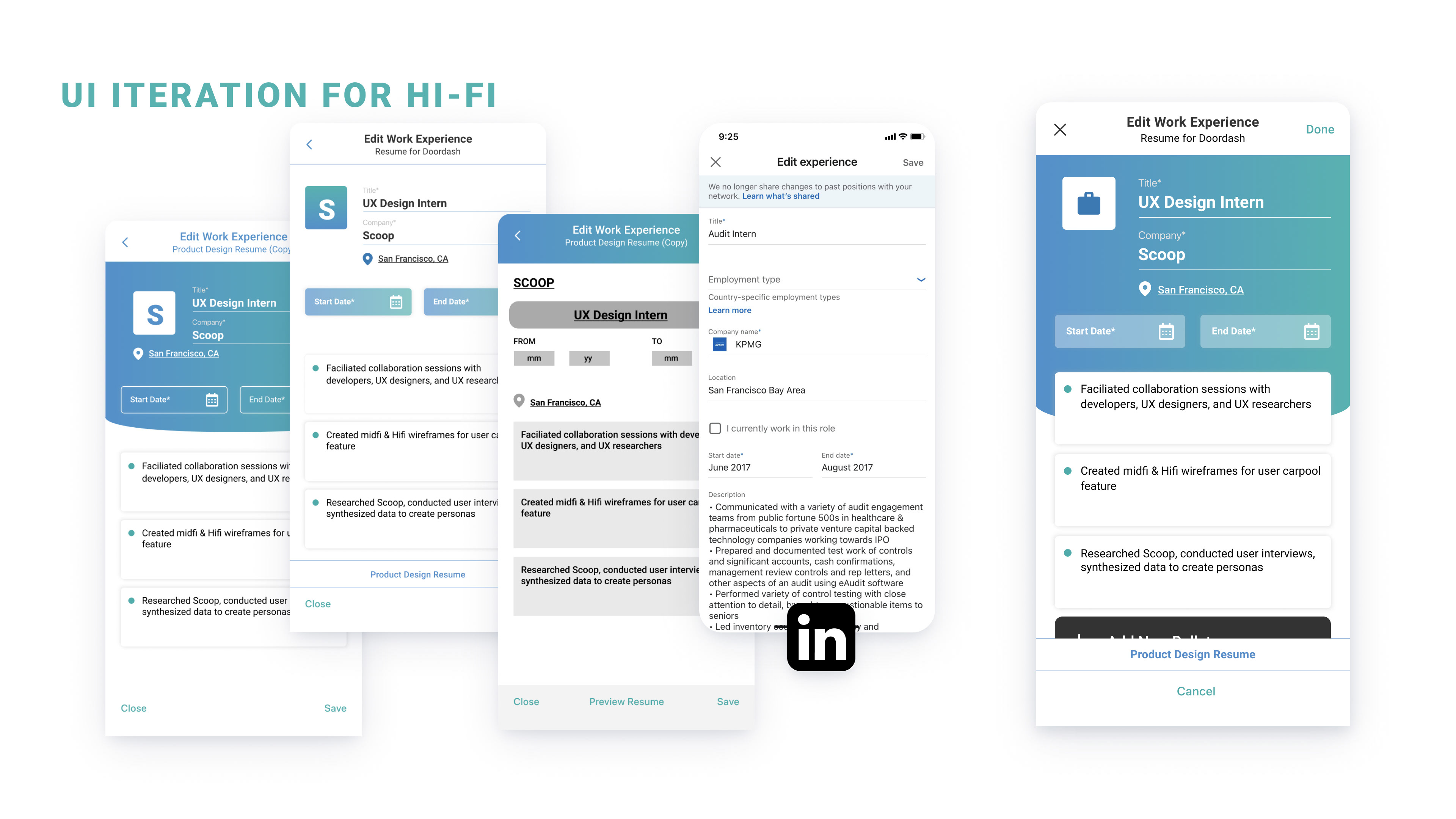
UI Iterations for Hi-fi
Final Design
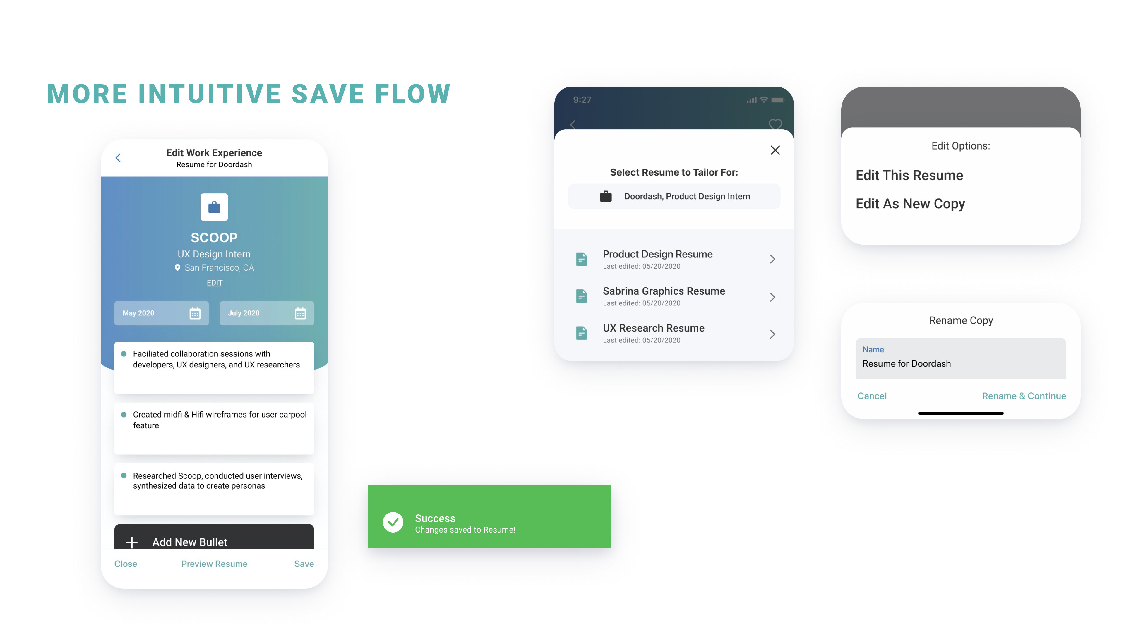
After our usability Testing Round 2 we came up with this finial iterations:
-Close and Save logic iteration
-Success confirmation
-Ability to just edit as new resume rather than save as new at the end
-Explain logic of flow (done at each stage and save at the end on main editor with the old flow , now it is just save as you go)
-Find keywords more apparent
-Words are now the same row and look , but you can delete the ones you selected - makes more sense to users this way
-Words are now the same row and look , but you can delete the ones you selected - makes more sense to users this way

Hi-Fi
Please click the button below to see the prototype
(View on desktop browser for a better experience)
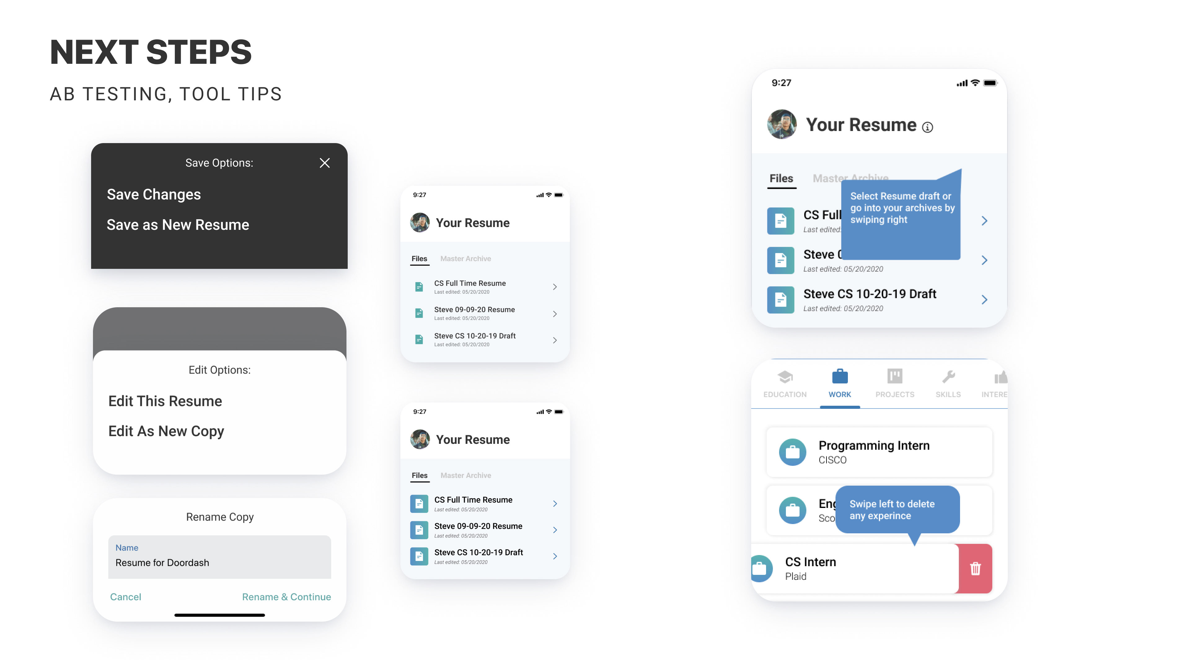
create tooltips for the resume section so users can understand how to use the features in the app.
we would also like to conduct some a/b testing on a few screns to better understand what icons and features are best suited for gen z and to understand users preferences in saving at the end or renaming a copy to edit in the beginning.
(We had some data on this during 2nd round of testing where users wanted to rename in the beginning of the flow but we would like to further test our new changes. And look into also adding the save options back in so users can both edit new and copy and/or save as new based on preference).