Overview:
QIQI YG Fashion, a Chinese-based e-commerce platform, offers a wide array of products, including shoes, clothing, kids' items, and accessories. Despite its diverse product catalog, the current website's e-commerce experience presented significant room for improvement.
My Role:
- Research
- Task Flow
- User Flow
- Sketching
- Wireframing
- Prototyping
- User Testing
- Site Map
- Card Sorting
Team Size: Individual project
Duration:Jan 2023 - Aug 2023
Approach:
My approach to enhancing the user experience for QIQI YG Fashion involved a systematic methodology, incorporating a range of methods and tools to achieve optimal results:
1.User Interviews: Conducted in-depth interviews with users to understand their pain points and expectations.
2.Personas: Created detailed user personas to represent the diverse customer base effectively.
3.Task and User Flows: Defined task and user flows to streamline the user journey and identify pain points.
4.Problem and Solution Statements: Identified key problems and devised corresponding solution statements.
5.Sketching and Wireframing: Utilized sketching and wireframing techniques to visualize and iterate on design concepts.
6.Prototyping: Developed interactive prototypes to simulate the user experience and gather valuable feedback.
7.User Testing: Conducted comprehensive user testing to validate design decisions and make iterative improvements.
8.Card Sorting: Implemented card sorting techniques to improve website navigation and organization.
9. Site Map: Created a comprehensive site map to provide a clear overview of the website's structure.
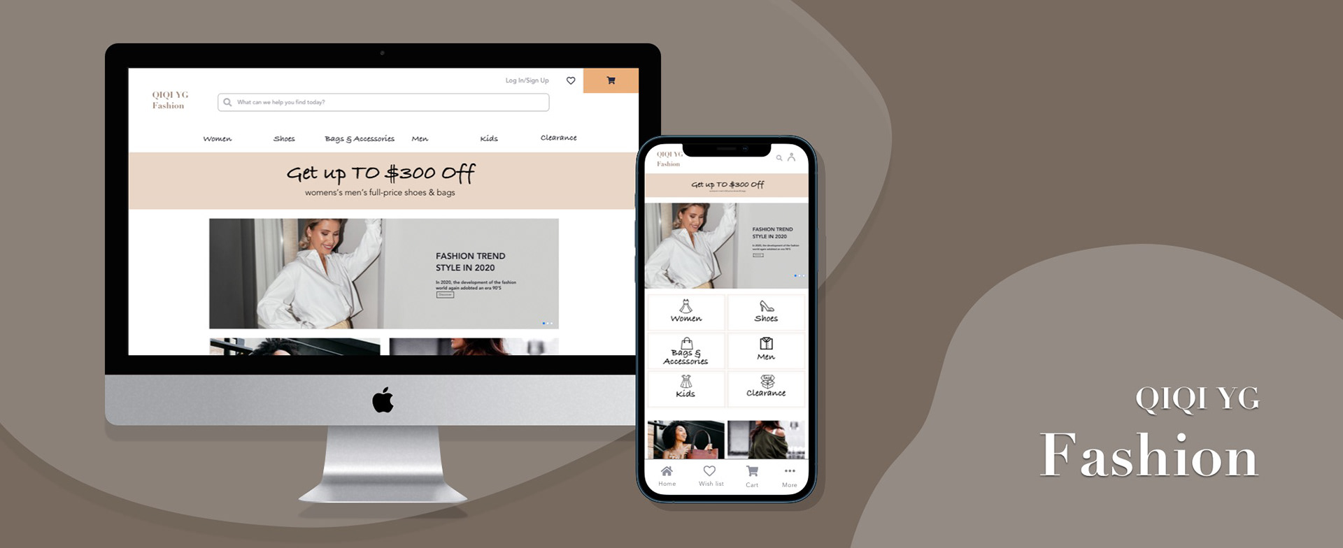
End Deliverable:
The culmination of my efforts resulted in the creation of a high-fidelity prototype, which embodies the solutions derived from research, design, and extensive testing.
Tools Used:
- Paper
- Sketch
- InVision
- Optimal Sort
- Whimsical
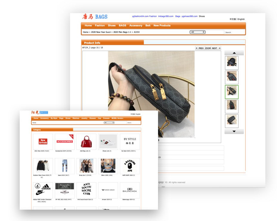
The Problem:
The existing QIQI YG Fashion website faced several critical issues:
- Lack of Navigational Structure:The absence of a clear navigational structure hindered users from efficiently finding products.
- Insufficient Information: Both the homepage and individual product pages lacked informative content, potentially leaving users with unanswered questions.
-No Product Reviews: The absence of product reviews deprived users of valuable insights and feedback.
-Ineffective Customer Support Connectivity: Users encountered difficulties in connecting with customer service, impacting their ability to seek assistance or resolve issues promptly.
My mission was to comprehensively address these issues, ultimately enhancing the overall user experience for QIQI YG Fashion customers.

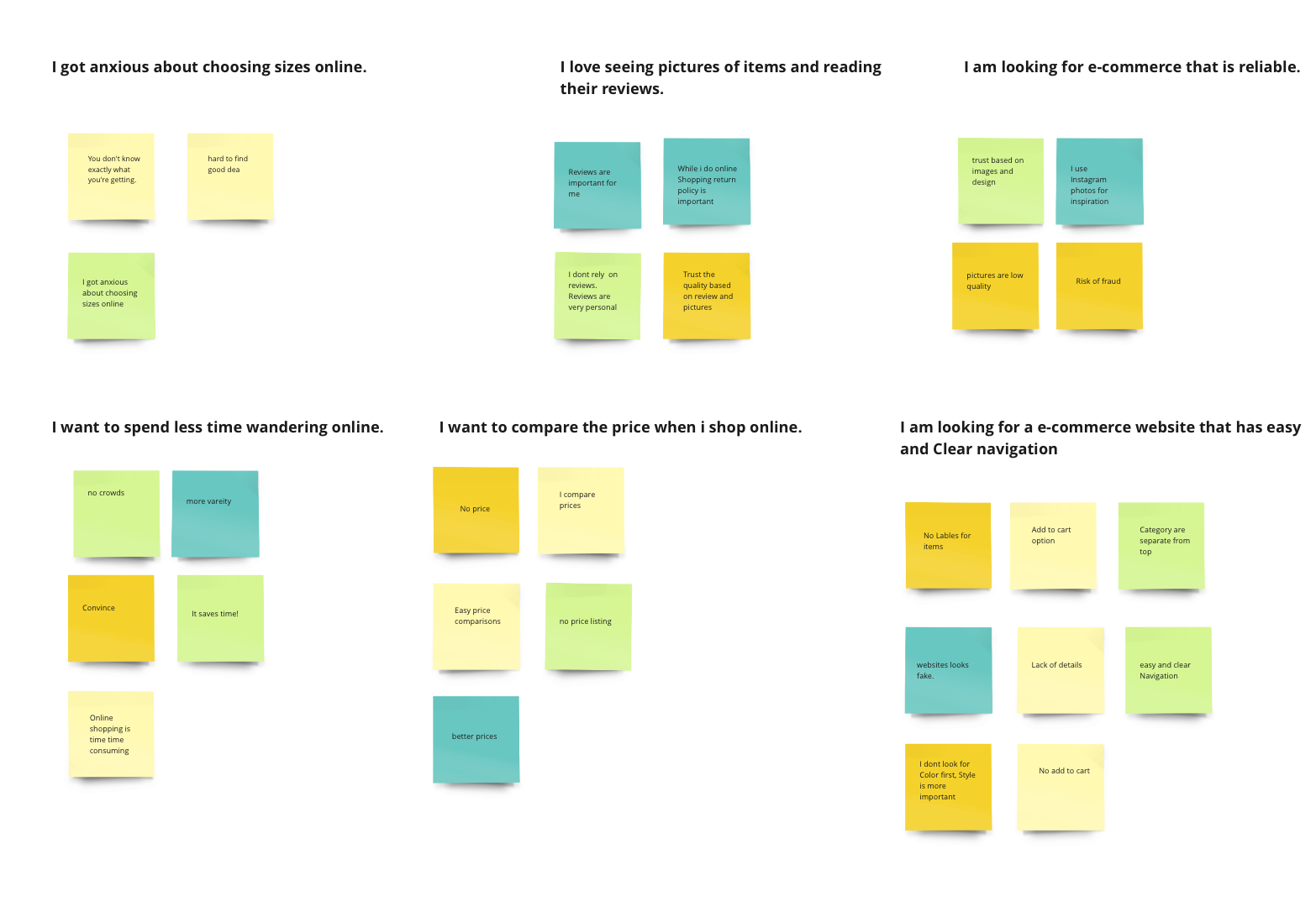
User Research:
In my pursuit of comprehending the needs of our target consumer base, I conducted interviews with four participants. From these interviews, I derived the following key statements and insights.
Competitive Analysis
In order to have a better understanding of QIQI YG Fashion competitors, I collected and compared data from three different online retailers apple and Ashley furniture. I highlighted their strengths and weaknesses, and identified their provisional personas. This was done in order to make more informed decisions about QIQI YG FASHION product strategy.
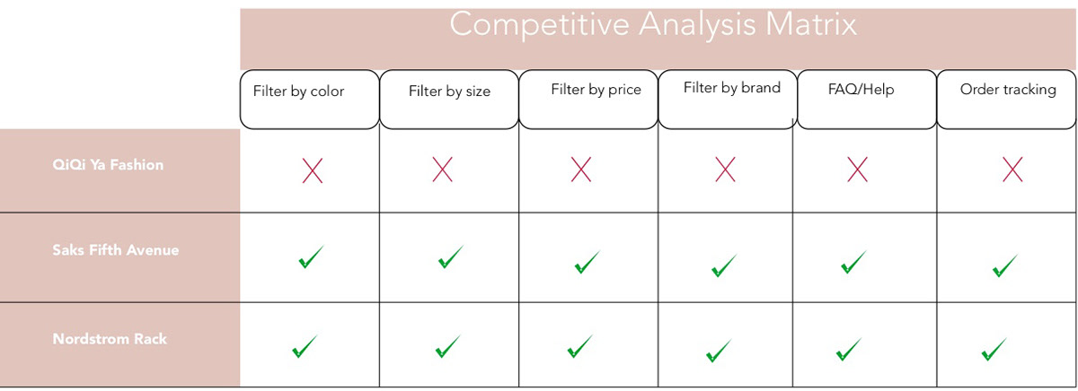
Comparative Analysis:
For my comparative analysis, I selected two similar clothing e-commerce websites, namely Saks Fifth Avenue and Nordstrom Rack. The table below presents the findings of this comparative analysis among the three mentioned websites. After carefully scrutinizing QIQI YG Fashion alongside these established retailers, I identified the following key features to incorporate into my website.
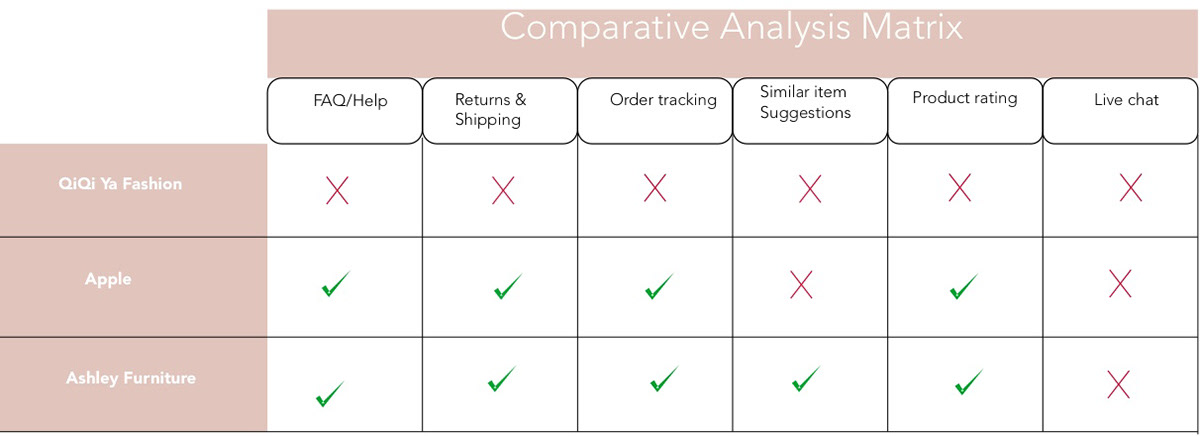
Features to Include:
In light of the comparative analysis and user research, the following key features are recommended for inclusion in the QIQI YG Fashion website:
FAQ/Help: A dedicated FAQ section to address common queries and provide assistance to users.
Return and Shipping: Clear information regarding the return policy and shipping options to enhance transparency.
Order Tracking: A functionality allowing users to track the status and location of their orders in real-time.
Similar Item Suggestions: A feature suggesting related or similar items to users based on their current selection, facilitating upselling and cross-selling.
Product Rating: The ability for users to rate and review products, providing valuable feedback and building trust.
Filtering Options: Enhanced filtering capabilities, including options to filter products by size, brand, color, and price, enabling users to find what they're looking for more efficiently.
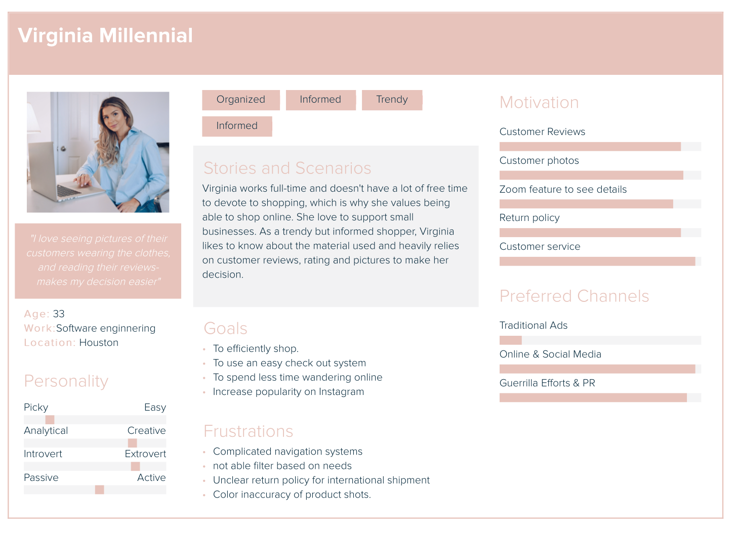
Persona (1): Virginia
Based on the research findings, I have crafted two user personas, with Virginia being our primary persona. Virginia, at 33 years old, is a software engineer by profession. Her previous experiences with QIQI YG Fashion have left her dissatisfied. Consequently, Virginia is actively seeking customer reviews, ratings, and product images to make informed decisions and minimize the time spent navigating the website.
Persona (2): Samiria
My secondary persona is Samiria, a 32-year-old Chemistry professor at the University of Houston. Her past interactions with QIQI YG Fashion have been less than satisfactory. Samiria seeks a highly organized website layout, a seamless and trustworthy online transaction process, and the ability to access and review customer feedback and ratings before making her purchasing decisions.

Problem Statement
●Virginia needs reviews on QIQI YG Fashion, because they can make informed decisions.
●Samiria, needs a better way to find a good quality product fast and easy, because there is no organization in QIQI YG Fashion.
Solution Statement
QIQI YG Fashion is an e-commerce website which users can easily and fast find the product and make decision based on reviews, details and filters by (sizes, Brands and Colors.
HMW questions
●How might we add the product reviews?
●How might we use a grid layout to organize information?
●How might we use dropdown category menus?
●How might we show a cart button in the top-right of the screen?
●How might we provide links to FAQs in the footer?
●How might we communicate instructions in lists or bullet points?
●How might we let customers speak to customer representatives?
Card Sorting Data
Information architecture is the foundation for a good user experience on an e-commerce website. I conducted a card sorting by taking representative items across all categories sold on the site to send out as an exercise for users to identify how they would intuitively group these items and what they would label their own sorted groups. I then interpreted the data to create a new site map.
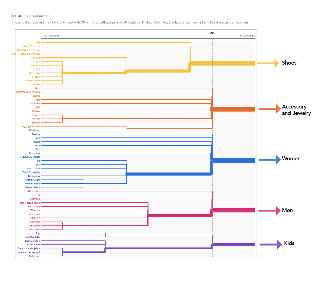
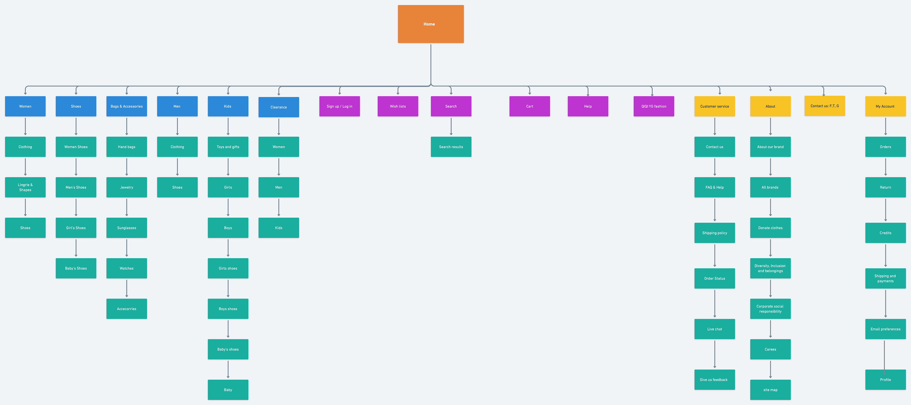
Site Map:
I crafted a site map to delineate the comprehensive structure of the website, drawing insights from the outcomes of the card sort exercise and inspired by the layouts of competitor websites. The primary aim was to guarantee that products would be positioned where users naturally anticipate finding them when navigating the website, thus rendering the shopping experience more intuitive and user-friendly.
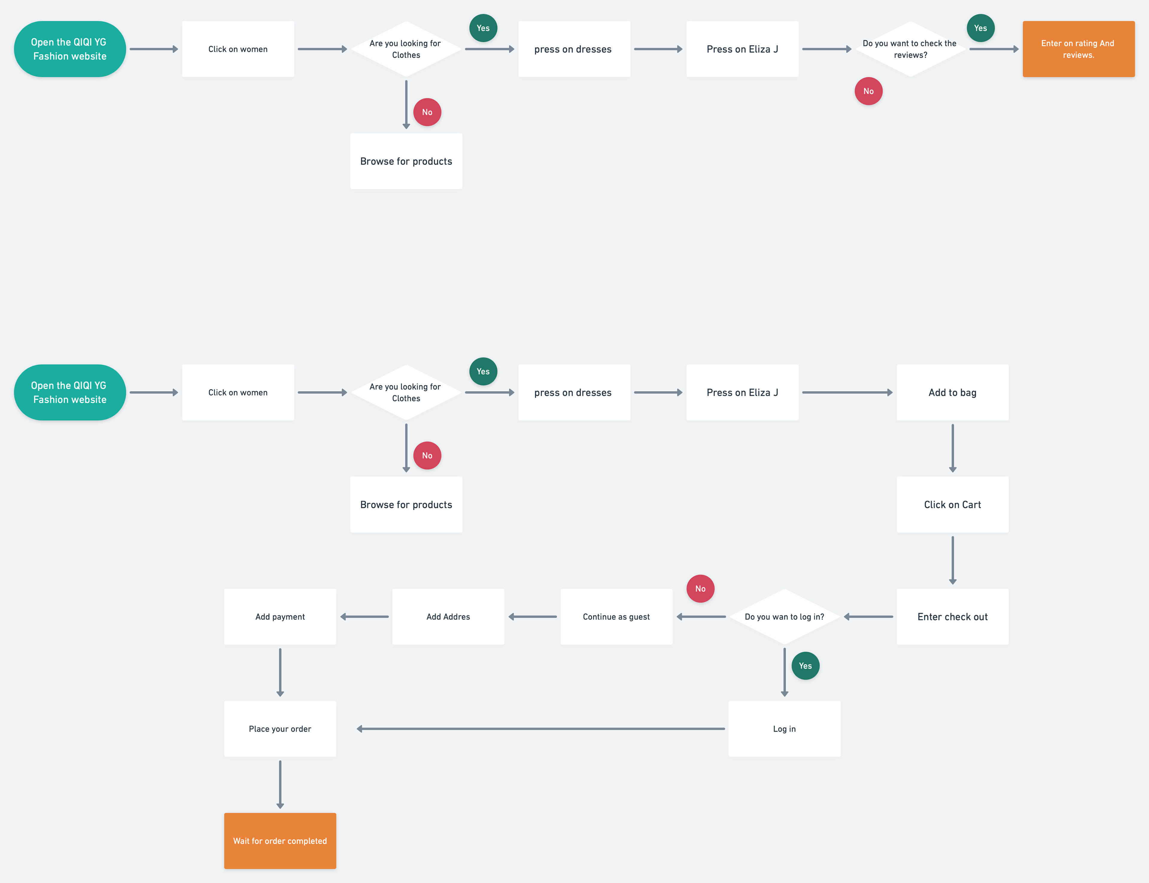
Task Flow:
Following the establishment of the website's structure, I proceeded to construct user flow and task flow diagrams that elucidate the navigation journey of both Samiria and Virginia as they engage with the QIQI YG website. These diagrams provide a visual representation of their respective interactions with the website.

User Flow:

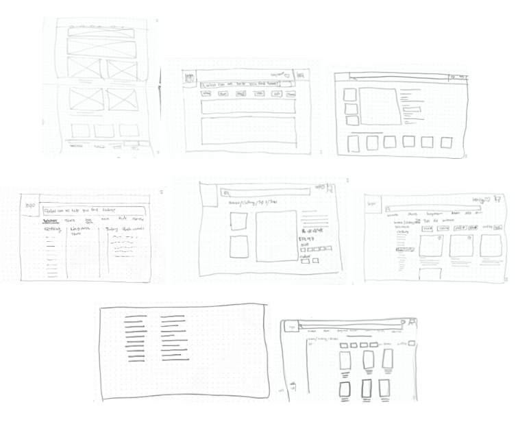
Sketches
Once I organised all my insights from the exploration phase, I began to design the website. To start this process I began to sketch several of the site’s main screens, using my user flows as a guide.
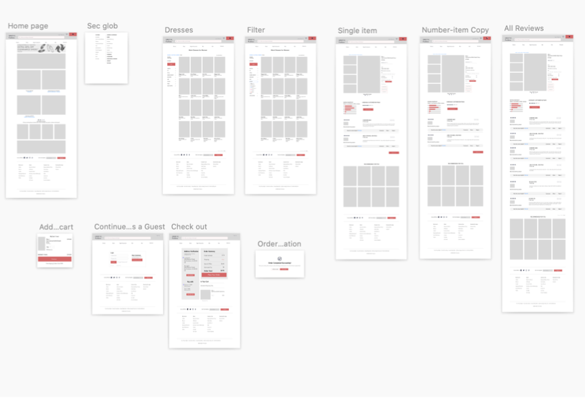
Wireframe:
I initiated the design of wireframes utilizing the Sketch application. Subsequently, I conducted user testing on my mid-fidelity prototype, specifically on mobile devices, to observe how users performed various tasks when provided with contextual information. This evaluation aimed to assess the user experience and refine the design accordingly.
Iterations
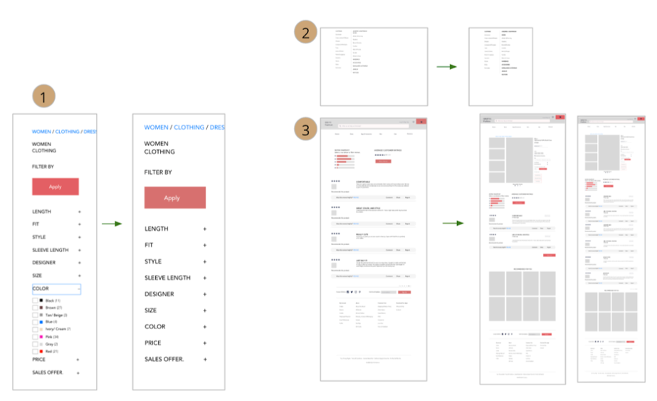
1.Add filter drop down menu for Color
2.Remove the negative space
3.move the reviews section from the separate screen to the bottom of the single product screen and added a “read more button” to show more reviews.

4.In the top right corner added a quantity of product to the basket.
5.Increased the font sizes of the products. And included more contrast to them.
6.Made “view order”” button bolder and rename the other one to return home.
7.Added address check and ‘’Edit address’’ button, Added pay method option or “pay with different” card button.
8.Added more information for new customers
Moodboard

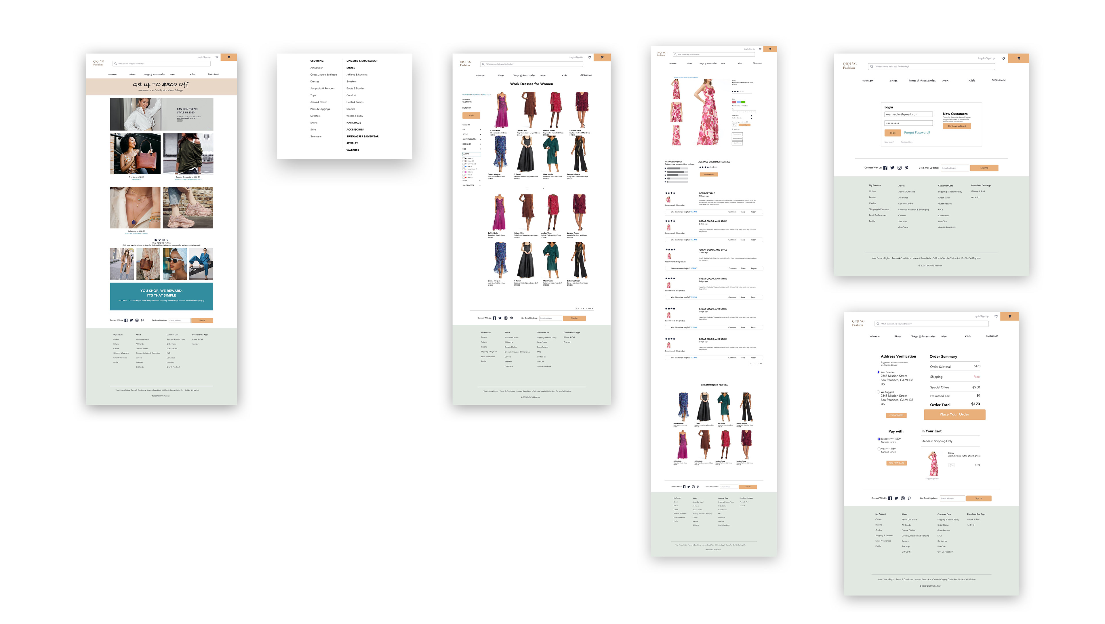
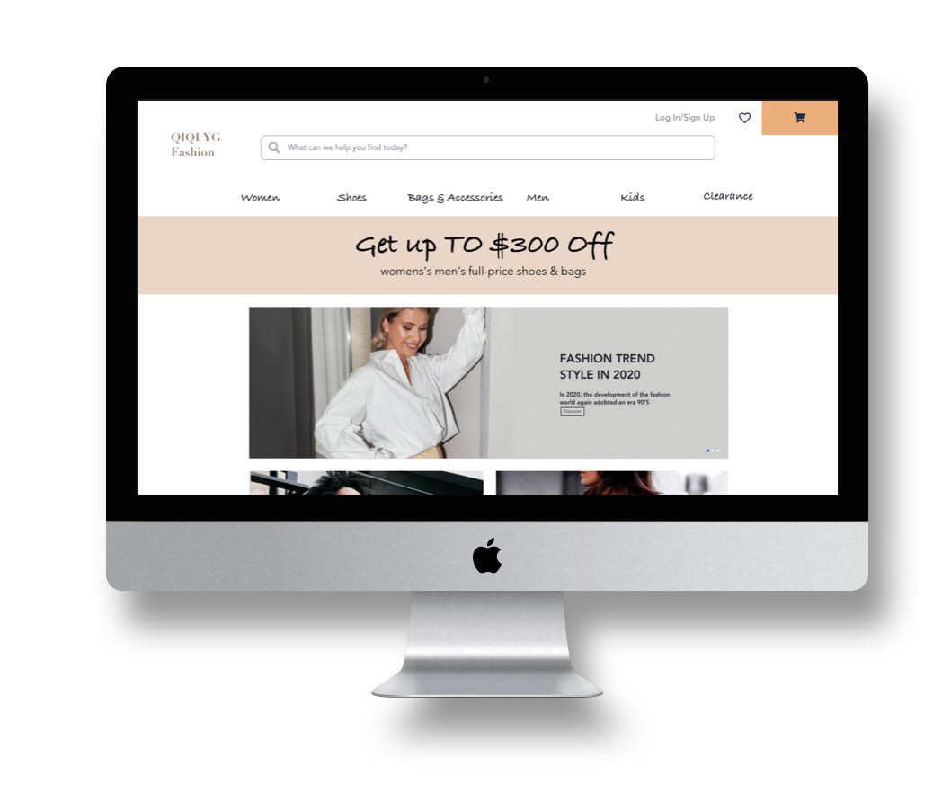
High-Fi(Desktop)
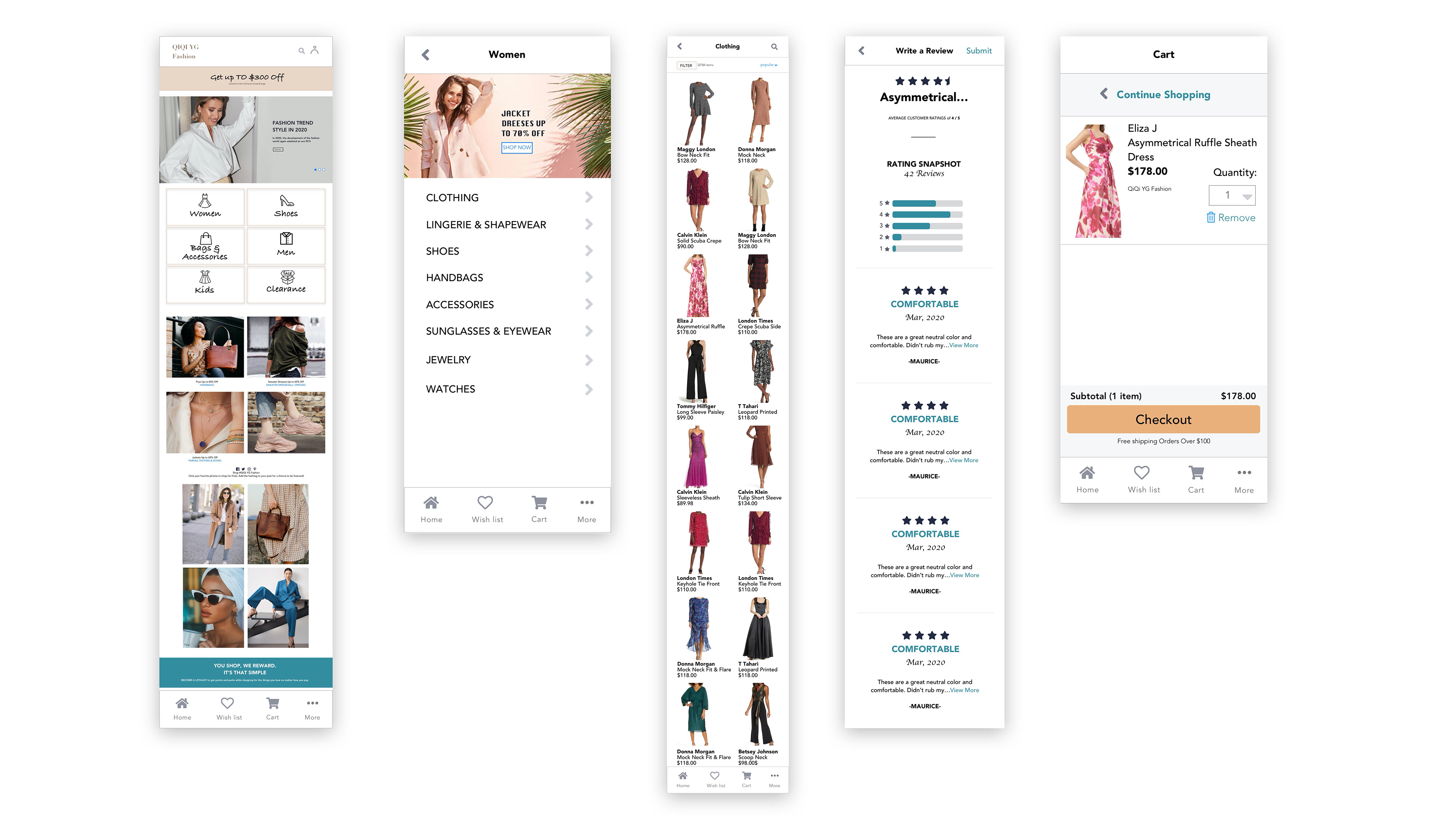
High-Fi(Mobile)
Prototype(Mobile)
Prototype(Desktop)
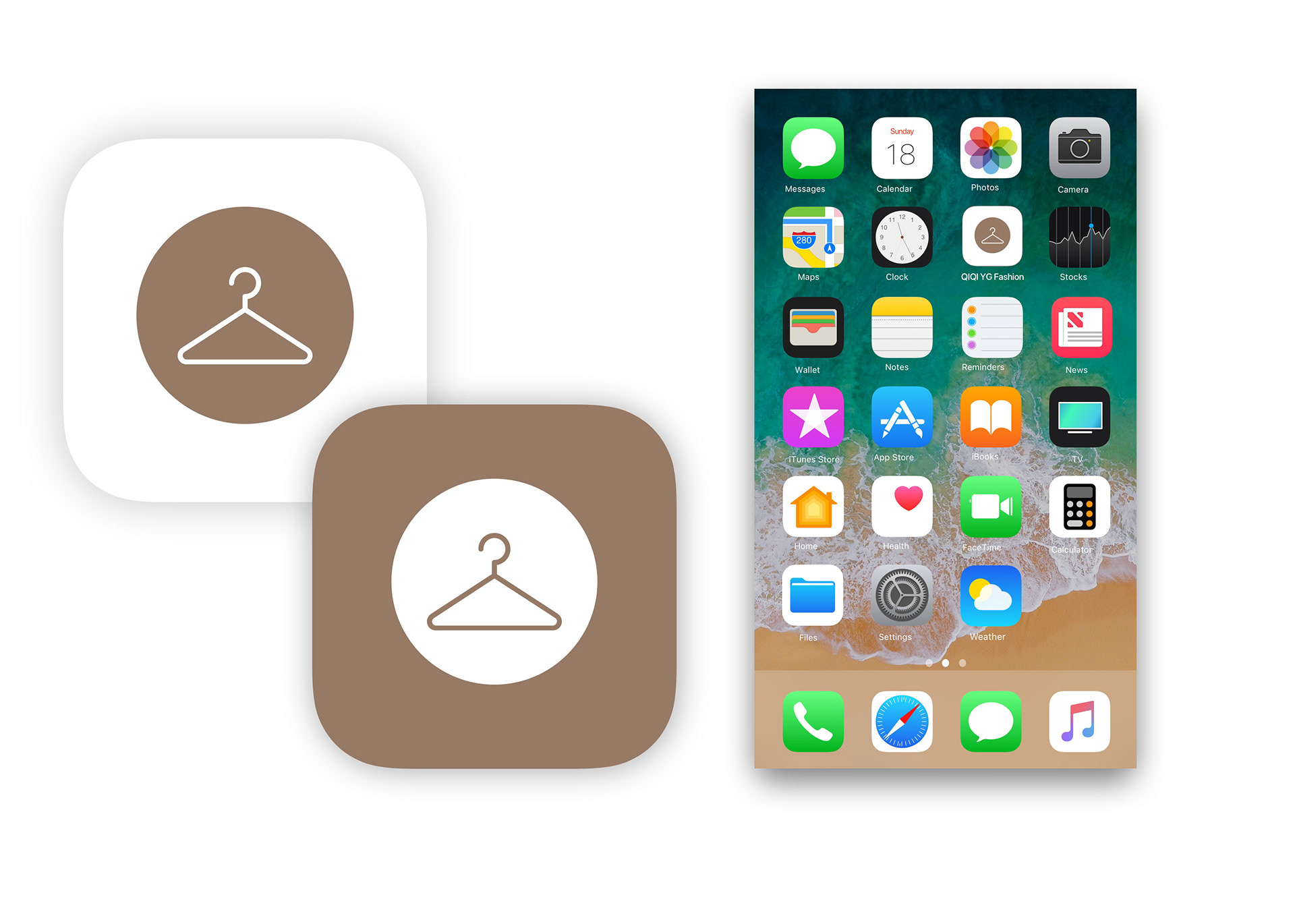
App Icon